


Risk Profile
Imagine you are the project manager for a small project. You need to buy two things, Item A and Item B, and you do not yet know what either will cost.
Item A will cost either $10 or $20, and both prices are equally likely (a 0.5 chance each). Item B will cost either $5 or $15, again with a 0.5 chance each. Because each item has two possible prices, the project can land in one of four total-cost scenarios:
- Item A = $10, Item B = $5, total $15 (0.5 × 0.5 = 0.25 probability)
- Item A = $10, Item B = $15, total $25 (0.5 × 0.5 = 0.25 probability)
- Item A = $20, Item B = $5, total $25 (0.5 × 0.5 = 0.25 probability)
- Item A = $20, Item B = $15, total $35 (0.5 × 0.5 = 0.25 probability)
Notice that $25 can happen two ways, so it is twice as likely as $15 or $35. As the project manager, you want to see the full range of total costs you might face and how likely each one is. That picture is what we call a Risk Profile.
A risk profile is a graph. The possible outcome values run along the x-axis, and the probability of each one runs along the y-axis. So it is just the probability distribution of your outcomes, drawn as a chart. In one look, you can see the spread of payoffs or losses and how likely each one is. For the example above, the risk profile looks like this:
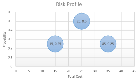
A risk profile tells you a lot about how risky each choice really is. Once you can see the spread of outcomes and their odds side by side, the safer and riskier options usually stand out right away. A choice with a high average can still hide a nasty worst case, and the risk profile is where that shows up.
To make this concrete, look at the following decision tree.

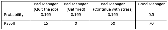
Suppose you take the job offer you already have in hand. The outcomes you could end up with are listed in the payoff table below, along with the probability of each one. Reading the table is simple: each row is one thing that could happen, and the number next to it is how likely it is.
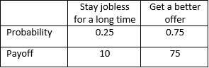
Now suppose you decide to wait for a better offer instead. In that case, your payoffs and their probabilities look like this:
The risk profile chart draws both of these probability distributions on the same chart. That way you can compare payoff against risk, outcome by outcome, and make a better-informed choice instead of leaning on a single average number.
To see it, expand the Options Analyzer for the tree above. The risk profile chart appears in the Carousel.
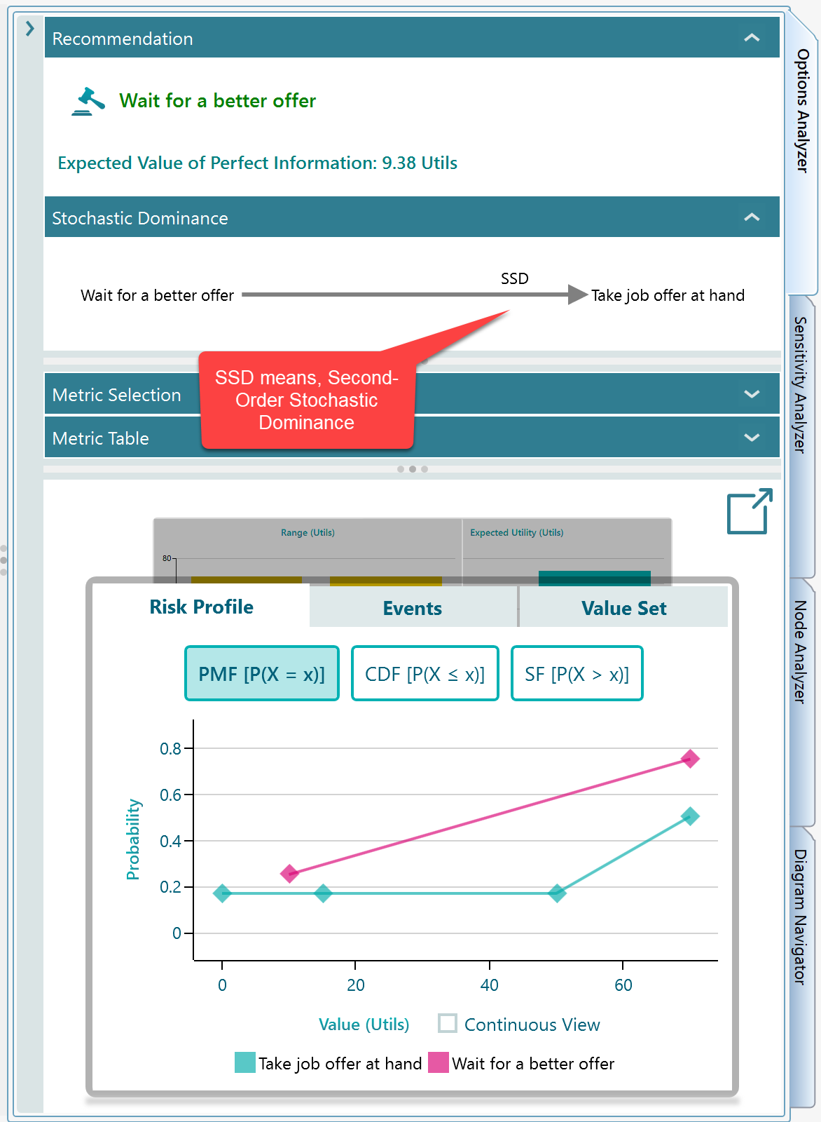
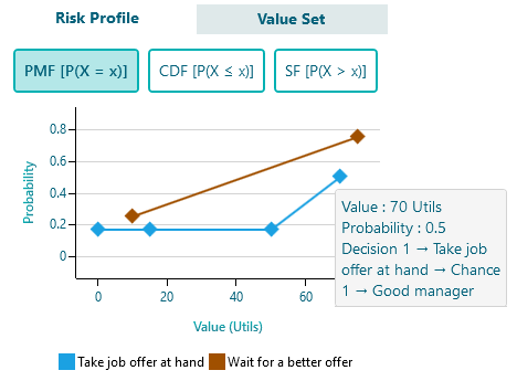
If you look closely at the risk profile chart, you will see it is just a picture of the same probability distribution tables we walked through above. Nothing new is added. The numbers from the tables become the heights and positions of the points on the chart.
Hover over any data point and a tooltip shows the details behind it, including the event name. For example, hover over the point at X = 75 for the action "Take job offer at hand" and the tooltip spells out exactly which event that point represents, as shown below.
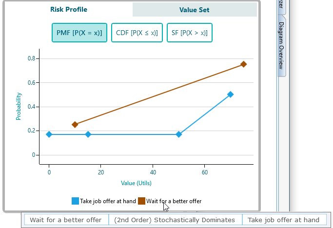
Stochastic Dominance
Stochastic Dominance is a way of ranking one random outcome against another. When one action stochastically dominates another, it gives you better odds at every level, so you can prefer it without arguing about averages. It is explained in full on its own page. Once it has been calculated, the result shows up in two places: in the stochastic dominance panel, and in the tooltip on the action name in the risk profile chart. So you can read it without leaving the chart.
Cumulative Distribution Function chart
It often helps to look at the cumulative distribution of two options so you can compare their payoffs and risks outcome by outcome. The cumulative distribution answers a simple question at every point: what is the chance the value is at most X? This comparison is also the foundation of Stochastic Dominance, which is covered on a separate page. To see the cumulative distribution for your risk profile, just click the CDF button, shown here.
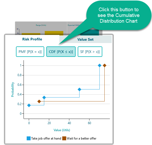
Reading the cumulative distribution chart above, you can tell that the action "Wait for a better offer" stochastically dominates the action "Take job offer at hand." In plain terms, waiting gives you better odds across the board.
Survival Function Chart
The survival function tells you the probability that something will last beyond a given point. A classic example is medicine. If you want to know the chance that a patient survives at least a certain number of days, the survival function gives you that number.
It is the mirror image of the cumulative distribution. The cumulative distribution answers "what is the chance the value is at most X?", while the survival function answers "what is the chance the value is at least X?"
To see the survival function for the same risk profile, click the SF button, as shown below.
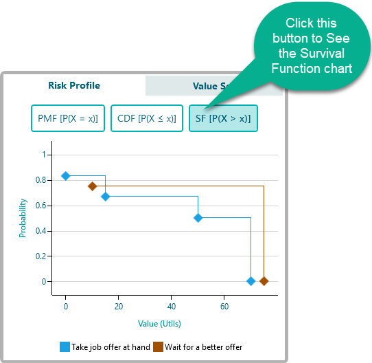
The survival function is one of the easiest ways to spot stochastic dominance between two options at a glance. Look at the chart above: the "probability that at least value X occurs" is almost always higher for "Wait for a better offer" than for "Take job offer at hand." When one curve sits above the other like that, the higher one is the better bet. From that alone you can conclude that "Wait for a better offer" stochastically dominates "Take job offer at hand."
Showing shortlisted Alternatives
Risk profiles are great for understanding the risks and consequences of your choices. But once a decision has many options, studying every single risk profile gets tedious. Usually you only care about the top few, ranked by their expected value.
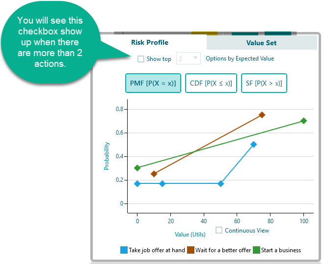
That is why, when you have more than two actions, the risk profile chart shows a drop-down labeled Show top X number of Options. It lets you focus on the strongest contenders instead of the whole crowd.
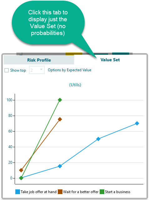
For example, say you add a third action, "Start a business," like this:
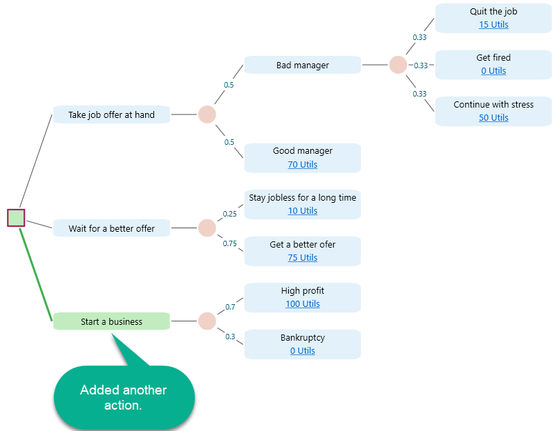
With that third action added, the risk profile chart now looks like this. Three sets of points share the same chart, so you can line them up and compare them directly:
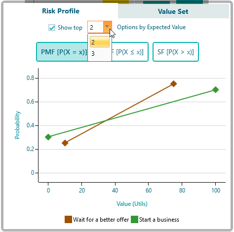
Tick that checkbox and you can pick the top X actions ranked by their expected values, so the chart only shows the options worth comparing. If you set it to show the top two, the weakest action drops off and the chart stays easy to read.
You can also hide any action on the chart by clicking its entry in the legend. Click it again to bring it back. In the example below, I clicked the legend item "Start a business" to hide its curve.
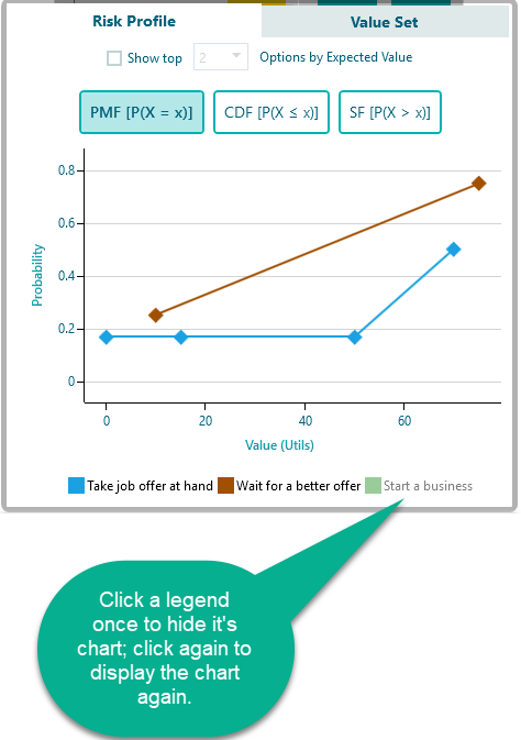
* Hiding an action from the legend only works when you are not already filtering the actions by expected value.
Showing all possible values (Another perspective of Risk Profile)
You can also view the full set of values for every option, which gives you a different angle on the same data. Instead of grouping outcomes by probability, it lays out each individual value. From the tab, select Value Set, as shown below.
Monte Carlo Simulation
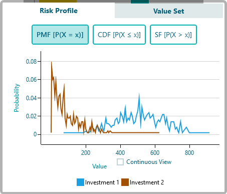
If you use a probability distribution as the payoff for any node, the risk profile chart is built automatically using Monte Carlo Simulation. This matters because a continuous distribution has infinitely many possible values, so you cannot just list a handful of discrete outcomes. Instead, the chart is drawn by running many simulated trials and seeing where the results land.
For example, say you have a decision tree where the profit for Investment 1 follows a normal distribution and the profit for Investment 2 follows an exponential distribution, like this:
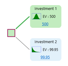
You will get the risk profile chart shown below, generated by Monte Carlo Simulation. The smooth shape comes from the many trials, not from a short list of fixed outcomes:
Node Analysis
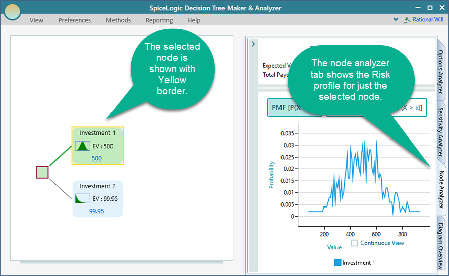
You can also get a risk profile for any single node you are interested in, not just the whole tree. Select the node, expand the Node Analysis tab, and you will see the risk profile for that node alone, as shown below. This is handy when you want to understand the risk at one specific point in the tree rather than the overall result. For example, you might check the risk that sits just past one chance event before the final payoff. Node analysis is covered in full on another page.
In short, the risk profile turns a single expected-value number into the full picture: every possible outcome and how likely it is. Pair it with the CDF and survival function views to compare your options outcome by outcome, and you can make a choice with your eyes open to the real risk, not just the average.