Dominance and the Cost-Effectiveness Plane
When your choices are mutually exclusive, meaning you can pick only one treatment or program, the average cost per unit of benefit does not tell you enough. What you really want is the incremental cost-effectiveness ratio (ICER). The ICER tells you the extra cost you pay for each extra unit of benefit when you step up from the next cheapest option. Looking at it this way keeps you honest. It forces you to ask whether the pricier option is actually worth the jump, instead of judging each option on its own.
Strong dominance (or simple dominance)
This is the easy case. If a new option costs more and gives you less benefit, there is no reason to pick it. It loses on both counts. We call this strong dominance, and some papers call it simple dominance. In the SpiceLogic Decision Tree software (and in Rational Will), it is called strong dominance. Say "Treatment A" costs more than "Treatment B" but is also less effective. Then "Treatment A" is strongly dominated. The software marks a strongly dominated option as a red dot on the cost-effectiveness plane, so you can spot it at a glance.
Extended dominance (or weak dominance)
This case is a bit more subtle. An extended-dominated option is not obviously bad. It costs more and gives more benefit than a cheaper option, so on its own it looks fine. The problem shows up when you compare it to a third, pricier option. That third option gives you so much more benefit for the money that the middle option is no longer a smart buy. In other words, your money would do more good somewhere else, so the middle option is ruled out by extended dominance. The software marks an extended-dominated option as an orange dot on the cost-effectiveness plane.
Efficiency frontier
The cost-effectiveness plane plots effectiveness along the x-axis and cost up the y-axis. The efficiency frontier is the line that connects the options that are genuinely worth considering. Dominated options fall to the upper left of this line, which is the bad corner: higher cost, lower benefit. The slope of each segment of the line is the incremental cost-effectiveness ratio between one option and the next best one. The most effective option sits at the far right of the frontier. If your willingness to pay for each extra unit of effectiveness is high enough to cover the ICER of an option on the frontier, the software highlights that option in light green to show it is the best choice you can afford.
A worked example
Let's walk through a real example with five options: Treatment 1, Treatment 2, Treatment 3, Treatment 4, and Treatment 5. Say the most you are willing to pay for each extra unit of effectiveness is $21,000. Here is what each treatment costs and what you get for it, measured in QALYs (quality-adjusted life years):
- Treatment 1 costs $50K for 10 QALYs.
- Treatment 2 costs $150K for 15 QALYs.
- Treatment 3 costs $450K for 20 QALYs.
- Treatment 4 costs $800K for 35 QALYs.
- Treatment 5 costs $750K for 40 QALYs.
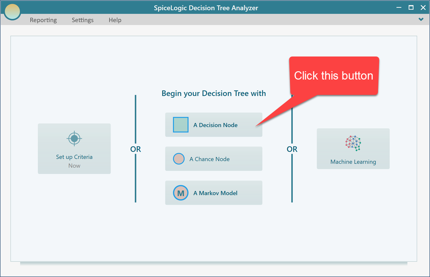
To set this up, start the Decision Tree software and choose the Decision Node to begin.
This takes you to the decision tree diagram page. Select the decision node shown below. A fly-over menu appears that lets you add action nodes as its children.
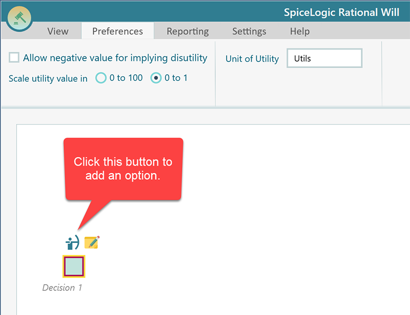
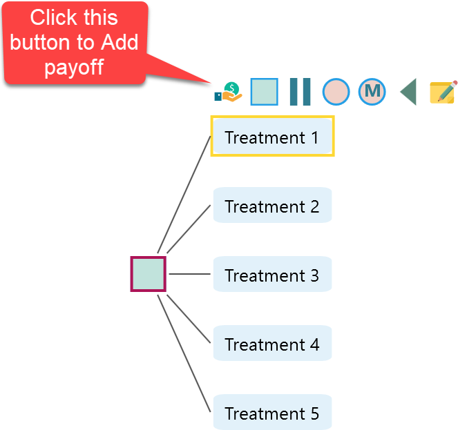
Click that button five times to create your five treatment options. To rename each one, double-click the node and edit it. For example, you can call them Treatment 1 through Treatment 5 to match the numbers above. When you are done, your diagram should look like this.
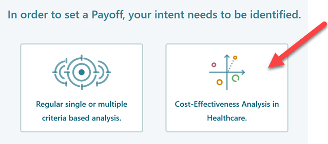
When this window appears, choose the second button, Cost-Effectiveness Analysis.
Next, open the Effectiveness tab shown below and choose the third option. We skip the first option, "Maximize QALY", on purpose. That option is for entering a utility value and a time span so the program can work out the QALY for you. Here we already have the QALY numbers in hand and just want a quick analysis, so the third option, which takes a direct QALY value, is the right fit.
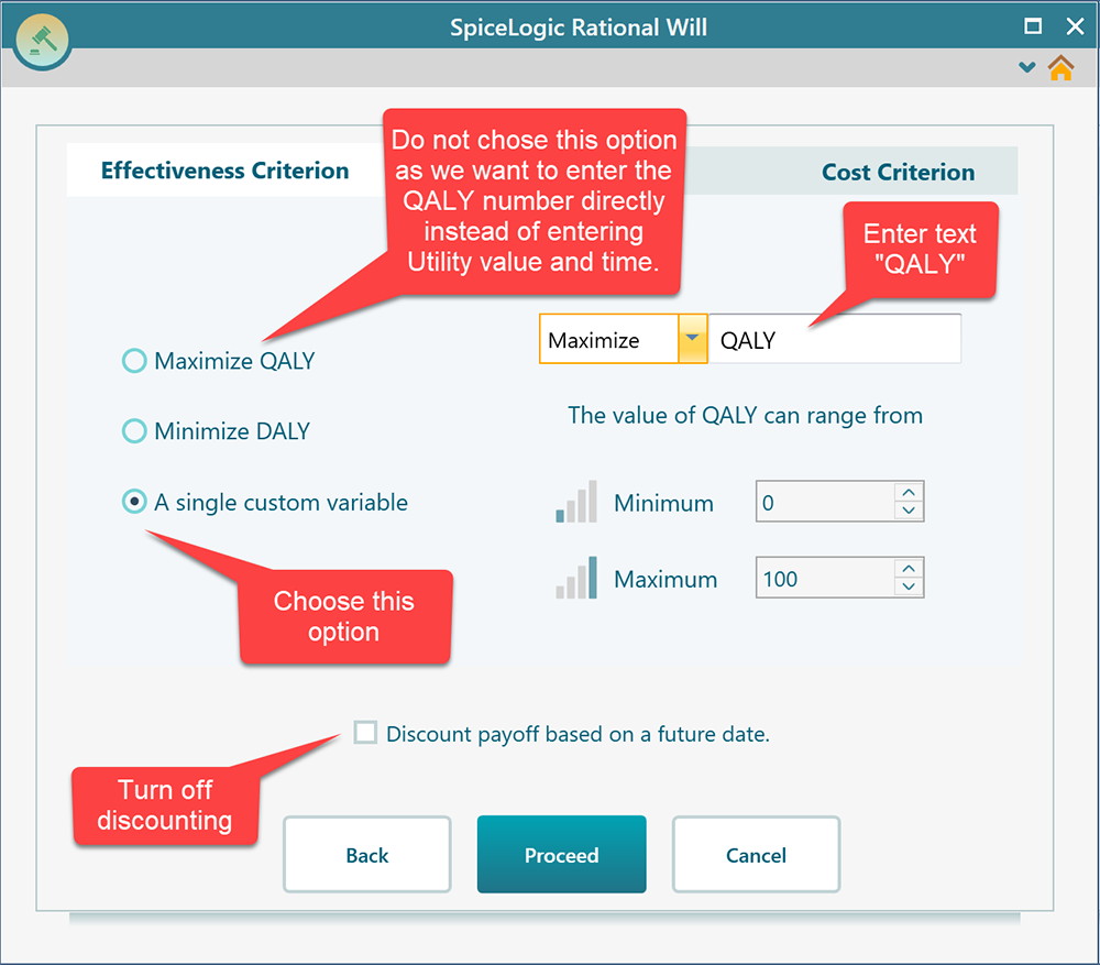
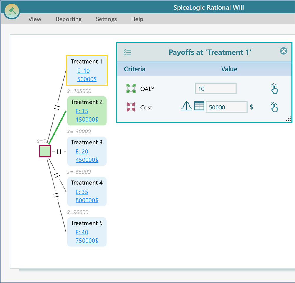
Now click the Cost Criterion tab. Check the Minimize Cost checkbox, then enter three values: the lowest possible cost, the highest possible cost, and the most you are willing to pay for each extra unit of effectiveness. For this example that last value is $21,000. Click Proceed. You are taken back to the decision tree diagram page, and the payoff editor opens. Set the payoff for each option as shown below.
Now expand the options analyzer panel. The Cost-Effectiveness Plane appears, as shown below.
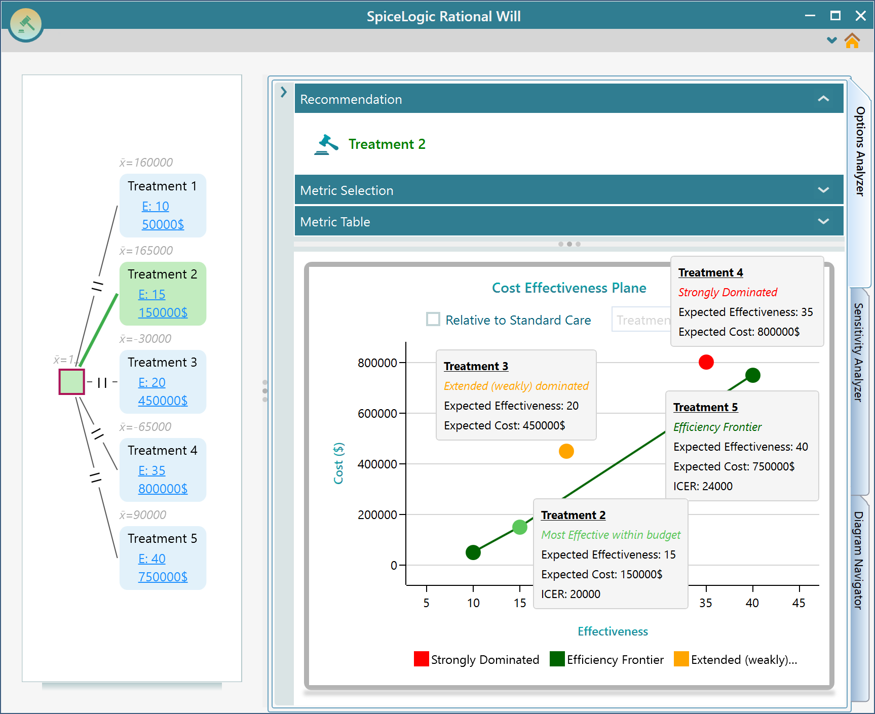
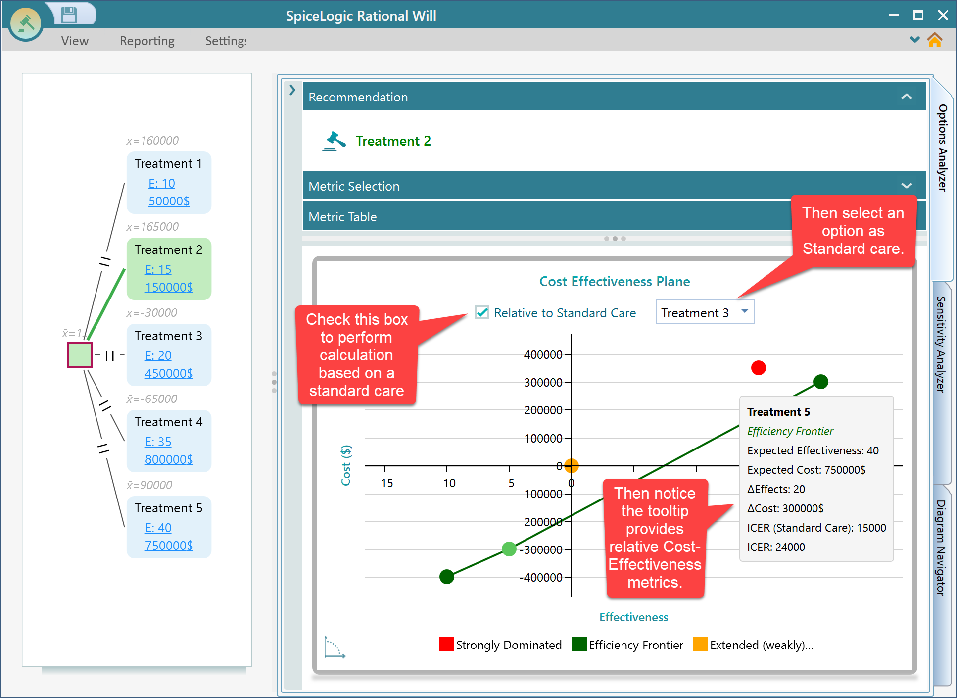
Each option shows up as a single dot on the cost-effectiveness plane. Hover your mouse over any dot and a tooltip appears, like the one above. It shows the option name, the expected cost, the expected effectiveness, and the ICER. It also tells you whether that option is strongly dominated or extended dominated.
The efficiency frontier line shows the options worth choosing for your budget. Remember, you said you are willing to pay at most $21,000 for each extra unit of effectiveness. Treatment 2 has an ICER of 2,000, which is well under $21,000, so the software shows Treatment 2 as the best option for you. If you raise your willingness to pay above $24,000, Treatment 5 becomes the best option instead. In the end, the final call is yours. The software lays out the numbers from several angles so you can make an informed decision.
Relative to standard care
You can also pick one treatment as your standard care, sometimes called the status quo. When you do, every calculation is measured against that baseline, and the tooltip shows all the cost-effectiveness metrics relative to it, as in the screenshot below. Notice that the x and y axes shift so the standard care option sits right at the center of the plane (X = 0, Y = 0). That makes it easy to see how every other option compares to it.