Decision Tree Node Analysis
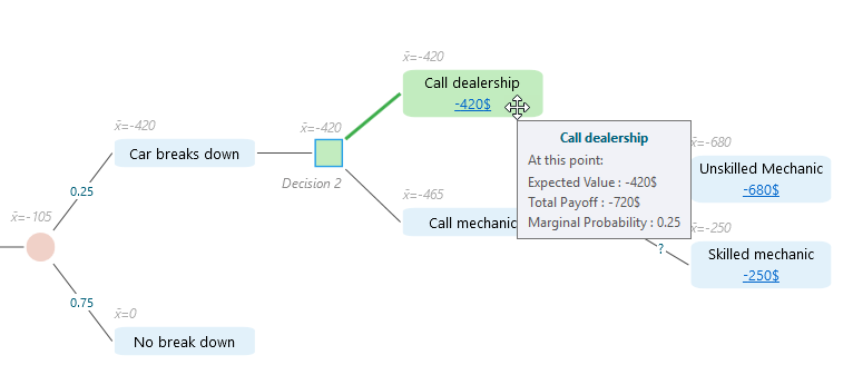
Every node in your decision tree holds a lot of detail behind the scenes, and you do not have to open panels to see it. Just move your mouse over any node and a tooltip pops up with the full set of metrics for that node. This is the quickest way to answer a fast question like "what is the expected value here?" or "how likely is this branch?" without changing anything on the screen.
Say you are deciding whether to drive or take the train to a meeting. Hover over the "Go by car" node and read its numbers right there. Then hover over "Go by train" and compare the two. You get your answer in a couple of seconds, and the tree stays exactly as it was. The tooltip below shows what one of these looks like.
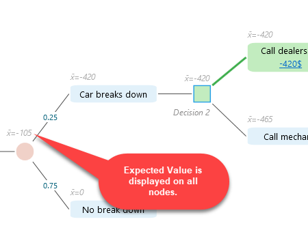
You will also see a number printed in light gray on every node. That is the Expected Value for the node, shown right on the diagram so you can read the whole tree at a glance without hovering over each one. The gray is picked on purpose: dark enough to read, light enough to stay out of the way of the tree itself. As you build or change the tree, these gray numbers update on their own, so you can always see how each branch is shaping up. For example, add a new branch with a better payoff and you will watch the gray number on its parent node climb right away.
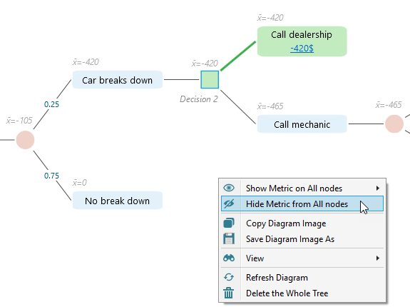
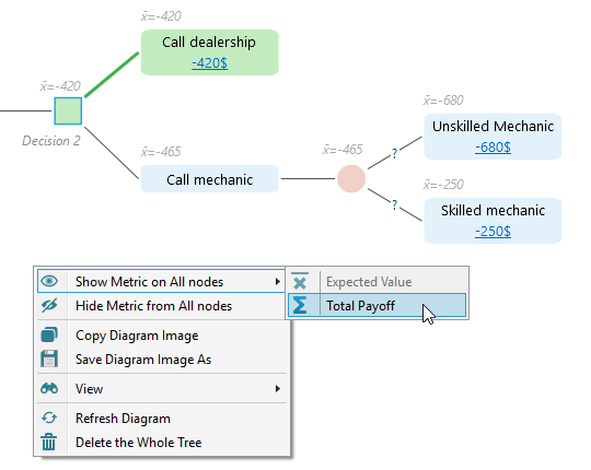
If your tree is large and all those gray numbers start to feel busy, you can turn them off for the whole diagram. Right-click anywhere on the diagram to open its menu and choose "Hide Metric from all nodes". The numbers disappear and you get a clean, tidy tree. This is handy when you are showing the tree to someone else and want them to follow the structure first, not the figures. Picture walking a client through the choices on a screen share: hide the numbers, talk through the branches, then bring the numbers back. You bring them back the same way, through the right-click menu, whenever you need them again.
Expected Value is the default number shown on each node, but it is not the only one you can put there. If you would rather see Total Payoff on every node instead, you can switch to that from the same diagram menu. Right-click the diagram and pick the Total Payoff option, and every node updates to show that figure in place of Expected Value. This helps when you care about the raw total outcome of a path, not its probability-weighted average. Think of a project where you want to see the full dollar amount each route ends at, before probabilities are factored in. You can switch back to Expected Value any time the same way.
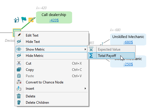
You do not have to change every node at once. If you only want to show or hide a metric for one node, you can do that too. Click the node to select it, then right-click to open the menu for that one node. There you will find options to show or hide the metric for just that node. This lets you keep the diagram clean overall while still pointing out the one or two nodes you actually care about. It comes in handy when you are explaining a single decision point and want all eyes on that node, with everything around it kept plain.
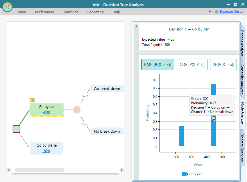
The numbers on a node tell you the headline result, but they do not tell you the full range of what could happen. For that, open the node analysis tab to see a complete risk profile for the selected node. It breaks down the possible outcomes and how likely each one is, so you can see not just the average result but the spread around it, including the best and worst cases.
In the decision tree below, for example, we have selected the "Go by car" node and opened its node analysis. Instead of a single number, you now see the whole picture of what driving might lead to. That makes it much easier to judge how risky that choice really is. Maybe the average looks fine, but the worst case is bad enough that you think twice. The risk profile is where you catch that.
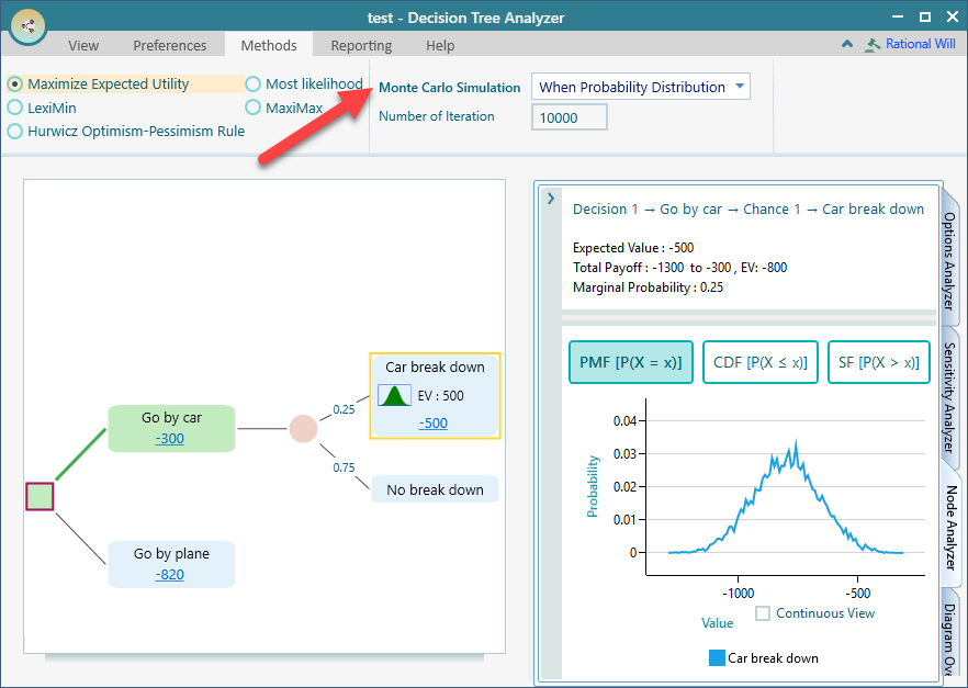
The risk profile gets even more useful when uncertainty is built into your tree. If the selected node, or any of the nodes below it, has a probability distribution attached, the app runs a full Monte Carlo Simulation to build the risk profile. In plain terms, it plays out the decision thousands of times. Each time it draws a different sample from each distribution, then it shows you the range of results that came out. This captures the real spread of outcomes far better than a single average can.
The screenshot below shows an example where the "Car break down" node has a Normal Distribution attached. Because of that distribution, the analysis runs many possible outcomes, some where the breakdown costs little and some where it costs a lot, and gives you a risk profile that reflects all of them. So instead of guessing how bad a breakdown could get, you see the whole range laid out.