


 NuGet
NuGet
Theme and style customization
WinFormHtmlEditor can share the visual language of your application without pretending to have a built-in dark mode. Theme the three public ToolStrip rows with normal WinForms rendering, replace individual button images, and style the HTML document separately.
What you can customize
- Toolbar surfaces: set the renderer, colors, grip style, and normal
ToolStrippresentation onToolbar1,Toolbar2, andToolbarFooter. - Buttons and lists: replace a button image or tooltip through properties such as
BtnSave, and coordinateCmbFontName,CmbFontSize, andCmbTitleInsert. - Document defaults: use
BodyStyle,DefaultFontFamily,DefaultFontSizeInPt, andDefaultForeColorto establish the editing canvas. - Application chrome: place the control inside your own panels, forms, status areas, and workflow actions.
The result can feel native to a line-of-business application while all editing commands remain the real shipped control.
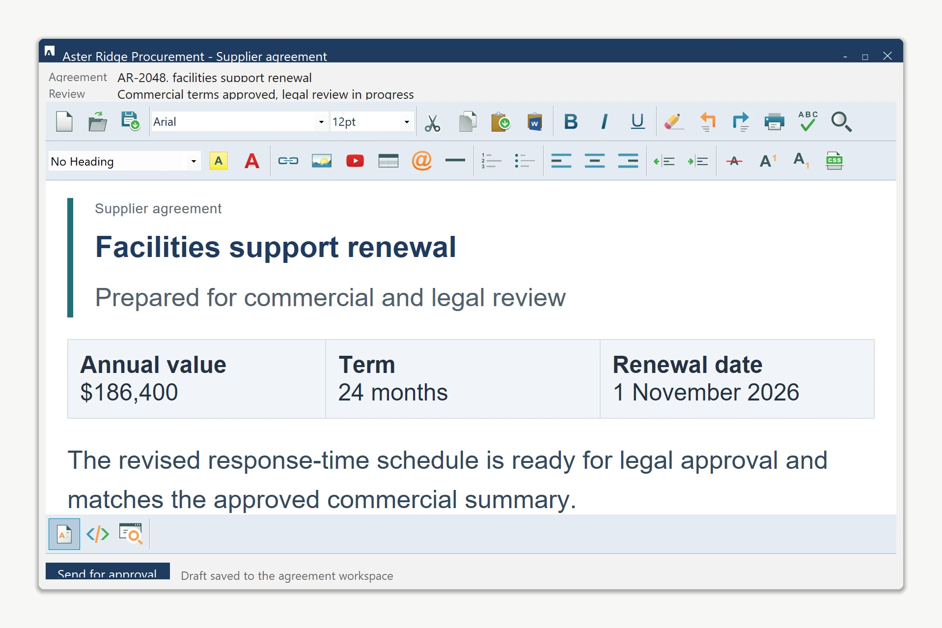
Apply a coordinated toolbar theme
Assign one renderer to all three toolbar rows after InitializeComponent(). Because these are live ToolStrip instances, standard WinForms rendering rules apply.
private void ApplyEditorTheme()
{
    var renderer = new ToolStripProfessionalRenderer(new EditorColorTable())
    {
        RoundedEdges = false
    };

    foreach (ToolStrip strip in new[]
             { htmlEditor1.Toolbar1, htmlEditor1.Toolbar2, htmlEditor1.ToolbarFooter })
    {
        strip.Renderer = renderer;
        strip.BackColor = Color.FromArgb(228, 235, 243);
        strip.ForeColor = Color.FromArgb(37, 49, 67);
        strip.GripStyle = ToolStripGripStyle.Hidden;
    }
}

private sealed class EditorColorTable : ProfessionalColorTable
{
    private static readonly Color Surface = Color.FromArgb(228, 235, 243);
    private static readonly Color Hover = Color.FromArgb(201, 217, 232);

    public override Color ToolStripGradientBegin => Surface;
    public override Color ToolStripGradientMiddle => Surface;
    public override Color ToolStripGradientEnd => Surface;
    public override Color ButtonSelectedGradientBegin => Hover;
    public override Color ButtonSelectedGradientMiddle => Hover;
    public override Color ButtonSelectedGradientEnd => Hover;
}
Private Sub ApplyEditorTheme()
Dim renderer = New ToolStripProfessionalRenderer(New EditorColorTable()) With {
.RoundedEdges = False
}
For Each strip As ToolStrip In {
htmlEditor1.Toolbar1, htmlEditor1.Toolbar2, htmlEditor1.ToolbarFooter
}
strip.Renderer = renderer
strip.BackColor = Color.FromArgb(228, 235, 243)
strip.ForeColor = Color.FromArgb(37, 49, 67)
strip.GripStyle = ToolStripGripStyle.Hidden
Next
End Sub
Private NotInheritable Class EditorColorTable
Inherits ProfessionalColorTable
Private Shared ReadOnly Surface As Color = Color.FromArgb(228, 235, 243)
Private Shared ReadOnly Hover As Color = Color.FromArgb(201, 217, 232)
Public Overrides ReadOnly Property ToolStripGradientBegin As Color
Get
Return Surface
End Get
End Property
Public Overrides ReadOnly Property ToolStripGradientMiddle As Color
Get
Return Surface
End Get
End Property
Public Overrides ReadOnly Property ToolStripGradientEnd As Color
Get
Return Surface
End Get
End Property
Public Overrides ReadOnly Property ButtonSelectedGradientBegin As Color
Get
Return Hover
End Get
End Property
Public Overrides ReadOnly Property ButtonSelectedGradientMiddle As Color
Get
Return Hover
End Get
End Property
Public Overrides ReadOnly Property ButtonSelectedGradientEnd As Color
Get
Return Hover
End Get
End Property
End ClassCoordinate icons and the document canvas
Use your application-owned image assets on individual toolbar buttons. Style the editable HTML body independently so saved document content remains intentional.
htmlEditor1.BtnSave.Image = Properties.Resources.SaveWorkspace16;
htmlEditor1.BtnSave.ToolTipText = "Save agreement to workspace";

htmlEditor1.BodyStyle =
    "background-color:#ffffff; color:#253143; " +
    "font-family:Arial; font-size:12pt; margin:0;";
htmlEditor1.BtnSave.Image = My.Resources.SaveWorkspace16
htmlEditor1.BtnSave.ToolTipText = "Save agreement to workspace"
htmlEditor1.BodyStyle =
"background-color:#ffffff; color:#253143; " &
"font-family:Arial; font-size:12pt; margin:0;"Keep the boundary clear
The host form, editor toolbars, toolbar icons, and document defaults are customizable. Built-in dialogs and the WYSIWYG document surface do not automatically inherit a host dark palette, so theme those areas deliberately instead of assuming a global dark-mode switch.
For complete ownership of the command surface, see replace the built-in toolbars with your own. To supply application-specific dialogs, see replacing the default dialogs.
Ask your AI to do this
Let your assistant do this for you. With the SpiceLogic MCP server connected, paste this into Claude Code, Cursor, or VS Code Copilot in agent mode.
Using the SpiceLogic WinForms HTML Editor already referenced in my project, make the editor match my application theme. Apply one ToolStripProfessionalRenderer to Toolbar1, Toolbar2, and ToolbarFooter, coordinate the toolbar colors and combo boxes, replace BtnSave.Image with my application icon, and set BodyStyle for the document defaults. Do not claim or simulate a built-in dark mode. Verify every member against the SpiceLogic MCP documentation before writing code.