


Custom Continuous Distribution
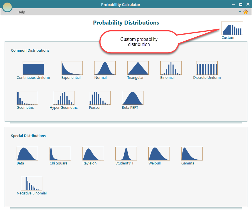
The gallery already includes most of the probability distributions people reach for. Still, sometimes none of them match the situation in front of you, and you need to build your own. That is what the Custom distribution is for. You can describe any shape you want. Either write it out as an expression in terms of "x", or hand the app a table of data points, which it connects with straight lines to form the curve.
Here is a quick example. Say your past records show that a delivery almost never finishes before two hours, becomes likely around three hours, and tapers off after five. No textbook distribution may match that exactly. With a custom distribution, you can shape the curve to follow what you actually see in your own data.
To get started, click the Custom button on the dashboard.
Using Piecewise Expressions
One way to build a custom distribution is to write it as a piecewise expression. "Piecewise" just means the function is made of more than one piece. Each piece applies over its own range of values. This helps when the shape changes from one region to the next. For example, the curve might stay flat in the middle and slope at the edges.
In this section we walk through a continuous distribution. That means x can take any value across a range, not only whole numbers. So x could be 2, or 2.5, or 2.73, anything in between.
Pick the piecewise option, shown below.
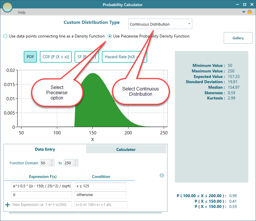
Look at the Data Entry tab in the screenshot above. This is where you type your expression using the variable x. Each line is one expression, and each line can carry its own condition that says when that piece applies.
If your whole function is a single expression, you do not need a condition at all. You can leave that condition box empty. But the moment you add a second line, every line needs a condition. Without one, the app has no way to know which piece to use for a given value of x.
Here is a simple way to picture it. You might say the density is one expression for x between 0 and 5, and a different expression for x between 5 and 10. The conditions are what keep those two pieces from overlapping. Each value of x lands in exactly one piece.
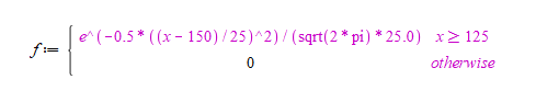
The expression shown in the screenshot above describes the following density function for the custom distribution.
The expression editor handles a lot more than simple arithmetic. To see everything it supports, read the Custom Expression Editor page.
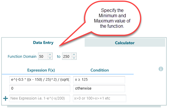
Function Domain
When you define a function with piecewise expressions, you also tell the app the range that x runs over. In other words, set the Minimum and Maximum value for the Probability Density Function.
This range is the domain of your function. It is the stretch of values the function actually covers. Back to the delivery example: if a delivery always lands somewhere between 0 and 8 hours, you set the minimum to 0 and the maximum to 8. The app uses these limits to draw the curve and to run its calculations. Set them too narrow and you cut off part of the curve, so pick limits that hold the whole shape.
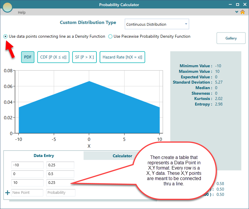
Using Data Points Table
If you would rather skip writing expressions, there is a quicker way. You can describe the distribution with a table of data points. The app connects those points with straight lines to form the curve. This is often the fastest route when you already have a rough shape in mind, or a handful of readings from real data, and you just want to plot them and join the dots.
For instance, you could enter a few points that start low, rise to a peak, then fall back down. The connected lines give you a simple triangle-shaped distribution with no math at all.
To do this, choose the 'Use data points...' option, shown below.
Scaling
However you build your custom distribution, from a points table or an f(x) expression, one rule holds for every real probability distribution: the total area under the Probability Density Function curve must equal 1. That is just another way of saying all the outcomes together have to add up to 100 percent.
You do not have to get this exactly right yourself. The app always scales your function for you so the area under the curve comes out to 1. So if you draw a shape whose area is, say, 2, the app shrinks every value by half to bring the total down to 1. Your shape stays the same, and it becomes a proper probability distribution.
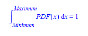
One thing worth keeping in mind. Every property and calculated value the app reports is based on the scaled function, not on the raw function you typed in. So if a number looks different from what you expected from your original expression, that is why. The app is reading from the version it adjusted to make the area equal 1.