Dominance and the Cost-Effectiveness Plane
When you have a set of mutually exclusive set of choices or treatment options, it becomes necessary to look at the incremental cost-effectiveness ratio as a basis for decisions, rather than at average cost-effectiveness ratios. The incremental cost-effectiveness ratio gives the added cost per unit of the added benefit of an option, relative to the next less expensive choice. The use of the incremental cost-effectiveness ratio permits the decision-maker to account for the fact that there was a less expensive option when selecting programs.
Strong Dominance (or simple dominance)
When we are comparing two alternative interventions or courses of action, it is relatively simple to determine if the new intervention or activity is less costly and more effective, is dominant, or if it dominates. This is known as strong dominance. In some papers, it may be referred to as "simple dominance". In the SpiceLogic Decision Tree software (or Rational Will), this type of dominance is referred to as strong dominance. For example, if "Treatment A" costs more but is less effective than "Treatment B", then, "Treatment A" is strongly dominated. SpiceLogic decision tree software shows the strongly dominated option in the cost-effectiveness plane as a red dot.
Extended Dominance (or weak dominance)
An intervention or action may be shown to cost more per additional unit of a benefit than another option, and thereby be ruled out by extended dominance. Unlike a strongly dominated option, an extended-dominated option is more costly but yields more benefits. The thing is that this type of extended-dominated option does not yield as much extra benefit as a third, more expensive option. SpiceLogic Decision tree software shows the extended dominated option in the cost-effectiveness plane as an orange dot.
Efficiency Frontier
In the cost-effectiveness plane, with effectiveness on the x-axis and costs on the y-axis, dominated interventions fall to the left and above the line representing the efficiency frontier. In this plot, the slope of the line connecting an intervention with the next best program equals its incremental cost-effectiveness ratio. In that efficiency frontier line, the most effective intervention (or option) resides at the right. If the willingness to pay for each additional unit of effectiveness covers the incremental cost-effectiveness ratio of an option within the efficiency frontier, then that option is shown as the most effective option within budget. That option is shown in a light green color to draw attention.
Worked out example
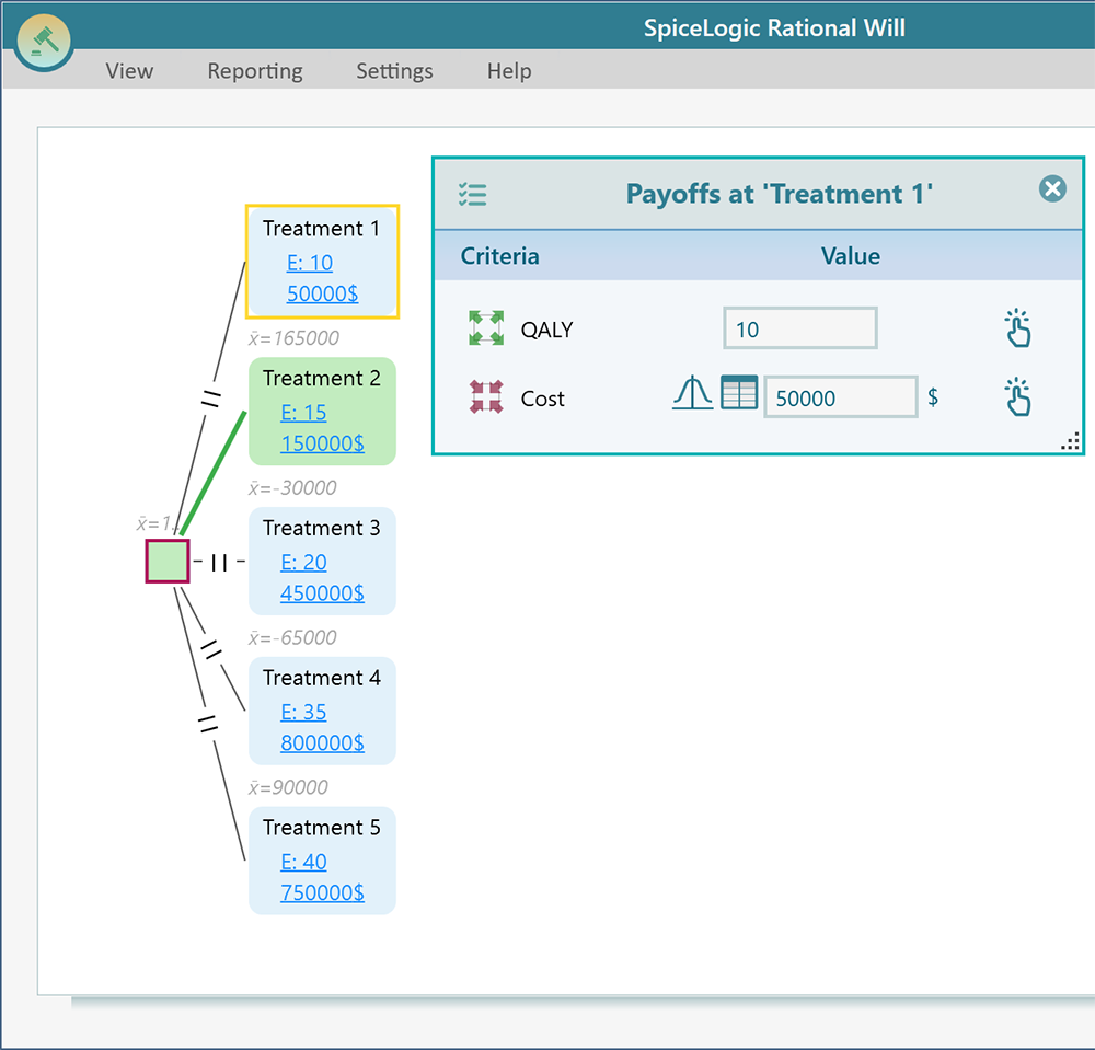
Let's model a situation where you have 5 options. Treatment 1, Treatment 2, Treatment 3, Treatment 4, and Treatment 5. Say, your maximum willingness to pay per effectiveness is 21,000$. "Treatment 1" costs 50K$ with 10 QALYs, and "Treatment 2" costs 150K$ with 15 QALYs. "Treatment 3" costs 450K$ with 20 QALYs. "Treatment 4" costs 800K$ with 35 QALYs. Finally, "Treatment 5" costs 750K$ with 40 QALYs.
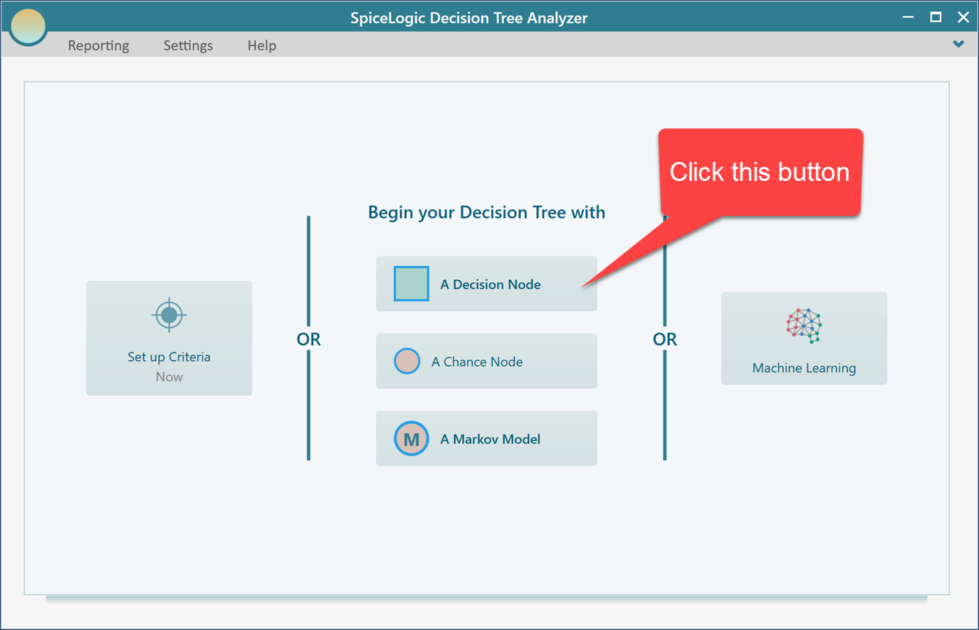
Start the decision tree software and choose the "Decision Node" to begin with.
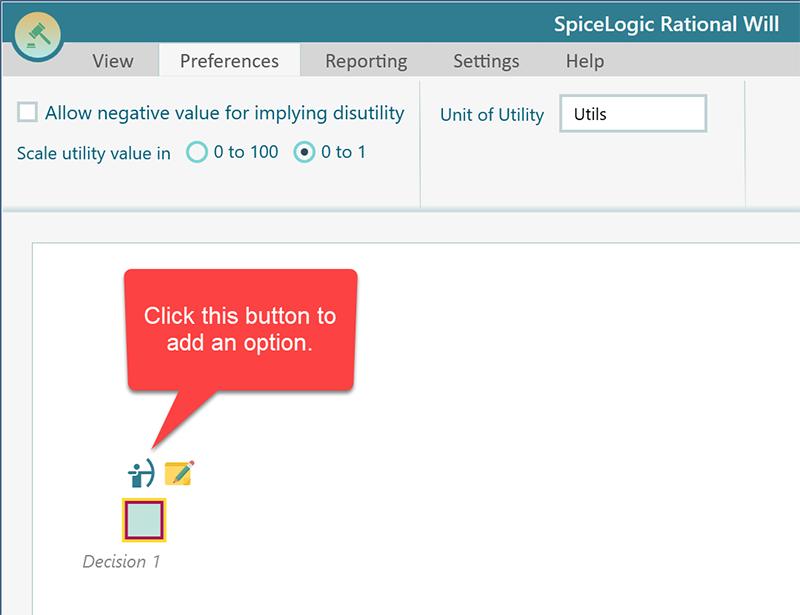
Then, you will be taken to the Decision Tree diagram page. Once you select the decision node that is shown below, you will see a fly-over menu shows up that will let you add action nodes as children.
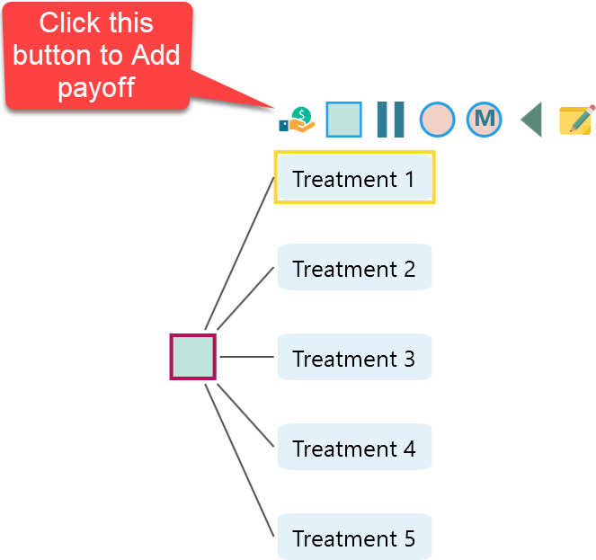
Click that button 5 times to create 5 treatment options. Double-click on the nodes to edit them. Your diagram should look like this.
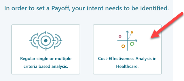
Then when this window shows up, choose the second button "Cost-Effectiveness Analysis".
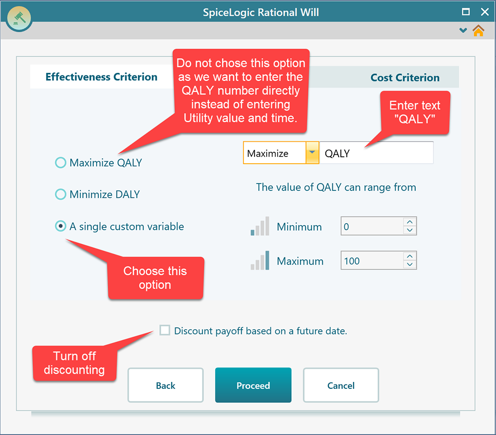
Then, in the Effectiveness tab as shown below choose the third option. Notice that, we are not choosing the first option "Maximize QALY" because that option is meant for entering Utility value and Time and the program will calculate the QALY for you. In this example, we want to perform a quick analysis with a direct QALY number. So, choosing the 3rd option.
Now, click the Cost Criterion tab. In this tab, check the "Minimize Cost" checkbox. Enter the minimum possible cost, maximum possible cost, and maximum amount of money that you are willing to pay for each additional unit of effectiveness. Then click the Proceed button. You will be taken back to the decision tree diagram page. The payoff editor will open. Set the payoff as shown below.
Now, expand the options analyzer panel and you will see the Cost-Effectiveness Plane as shown below.
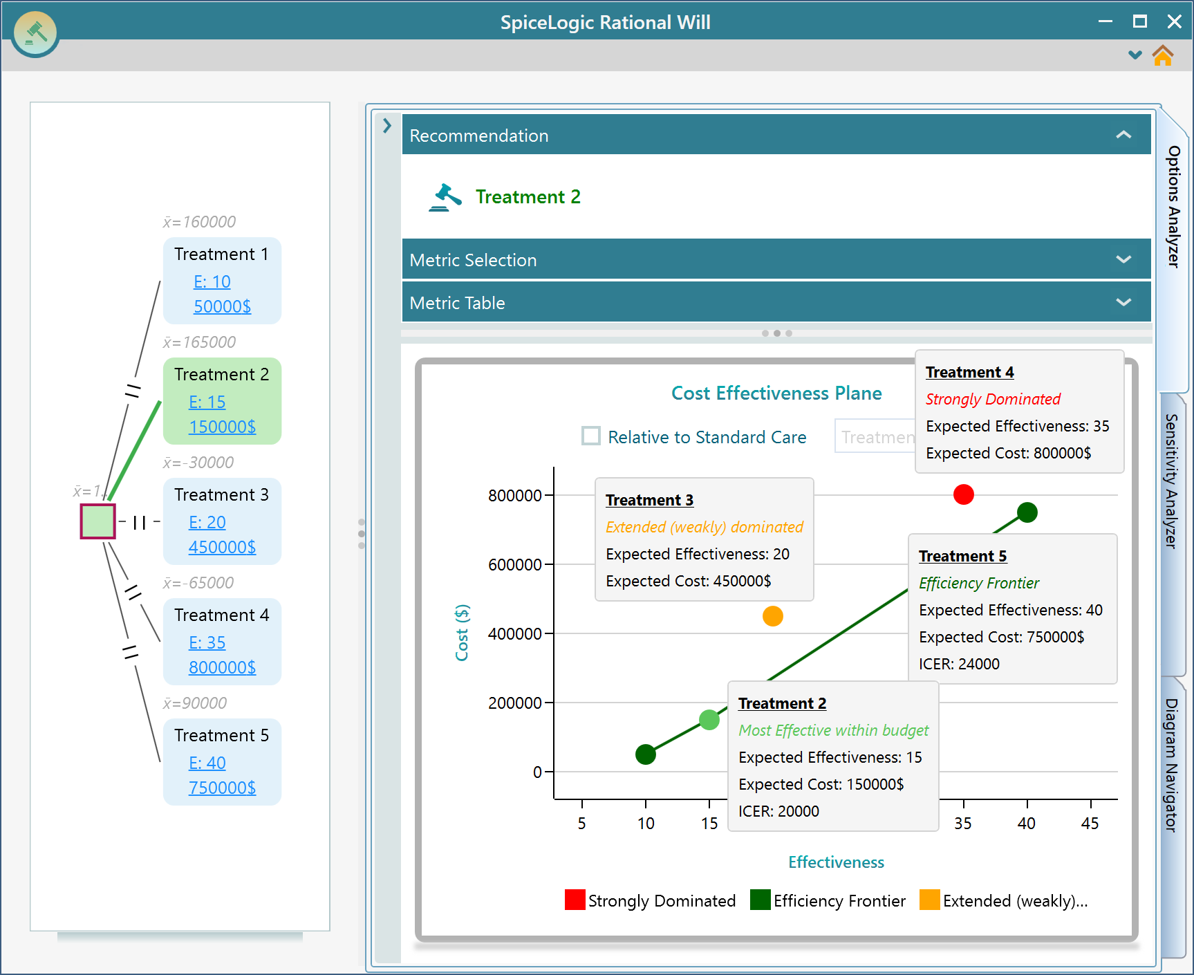
In the above screenshot, you can see that each option is represented in the cost-effectiveness plane as a single dot. If you place your mouse over that dot, you will see the tooltip as shown above. The tooltip shows the option name, Expected Cost, Expected Effectiveness, and ICER. Also, it tells if the option is strongly dominated or extended dominated.
The efficiency frontier line shows all the options that can be chosen based on your budget. Based on the fact that you are willing to pay 21,000$ at most for each incremental effectiveness. As Treatment 2 ICER value is 2000, which is less than 21,000$, Treatment 2 is shown as the best option for you. If you change your willingness to pay more than 24,000$ then you will see Treatment 5 will be shown as the best option for you. Finally, it is you, the decision-maker should make the final decision. This software will present you with various perspectives so that you can make an informed decision.
Relative to Standard Care
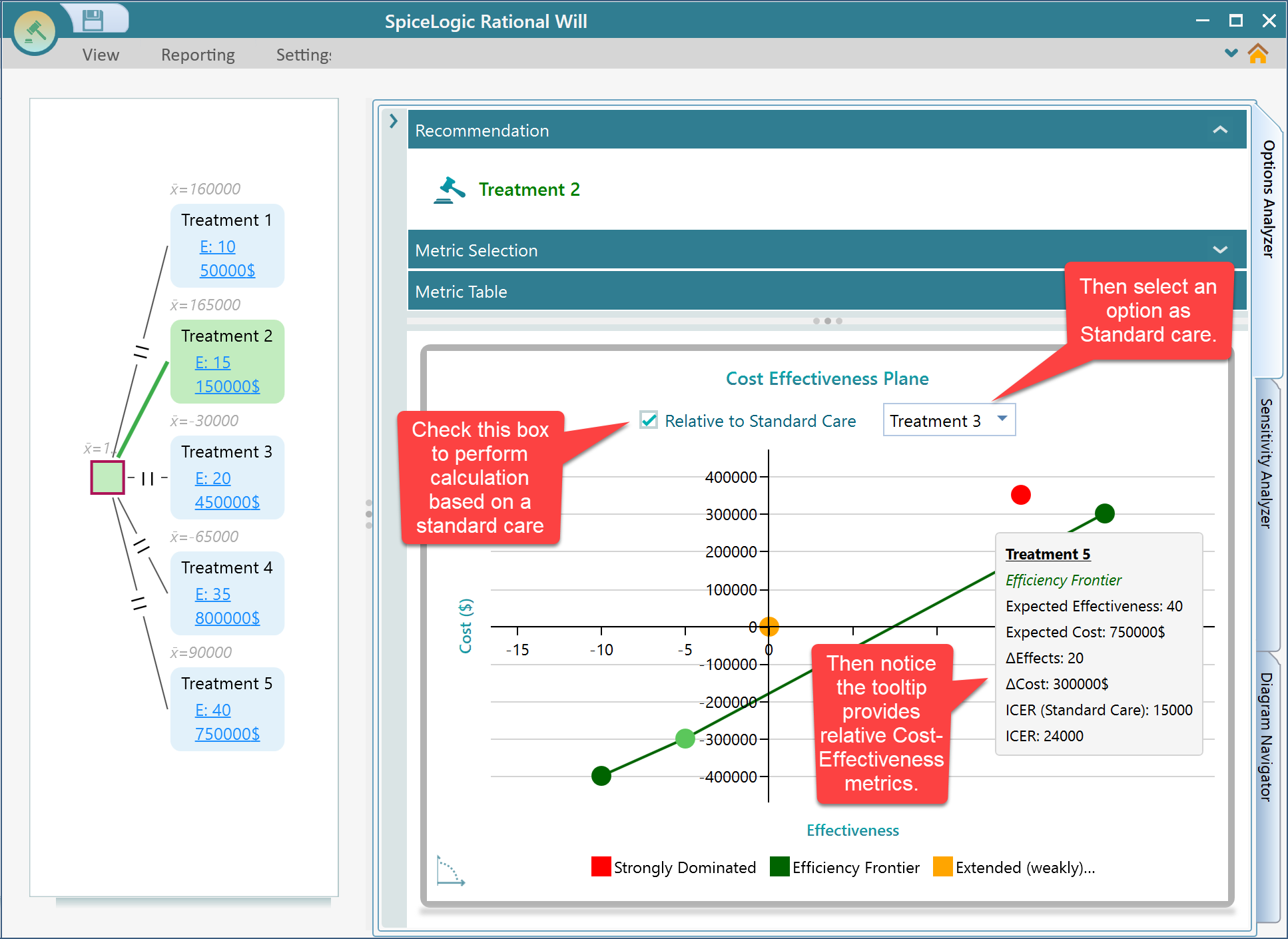
Yes, you can choose a treatment as standard care or status quo. If you select an option as standard care, then the calculation will be done based on that standard care option. All relative Cost-Effectiveness metrics will be shown in the tooltip as shown in the following screenshot. notice that the X and Y axis is shifted such that the standard care option resides in the center of the axis, (X = 0, Y = 0).
