Risk Profile
Think about a project where you are the project manager. You will have to buy two items for the project, Item A and Item B. The cost can be uncertain. Item A can cost either 10$ or 20$ (0.5 probabilities). Item B can cost either 5$ or 15$ (0.5 probabilities). So, there can be four possible scenarios,
Item A = 10$, Item B = 5$, (0.5 * 0.5 = 0.25 probability)
Item A = 10$, Item B = 15$ (0.5 * 0.5 = 0.25 probability)
Item A = 20$, Item B = 5$ (0.5 * 0.5 = 0.25 probability)
Item A = 20$, Item B = 15$ (0.5 * 0.5 = 0.25 probability)
As a project manager, you want to understand the possible range of total costs, along with their probabilities, which we call "Risk Profile." A risk profile is displayed as a graph with the consequence values along the x-axis and their associated probabilities along the y-axis. Thus, a risk profile is basically a probability distribution. In that way, a decision-maker can get an in-depth view of the comparative payoffs/losses along with probabilities. So, in this case, the risk profile is:
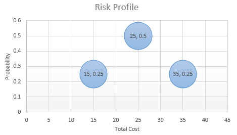
By looking at the risk profiles, the decision-maker can tell a lot about the riskiness of the alternatives.
For example, consider the following decision tree.
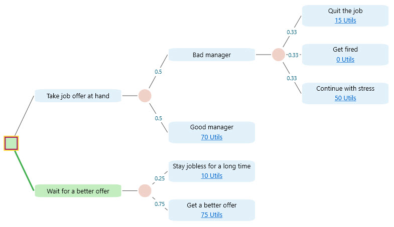
If you take the job offer at hand, your possible outcomes can be summarized in the following payoff table with the probability distribution.

If you wait for a better offer, then your payoff probability distribution becomes:

The risk profile chart shows these probability distributions in the same chart so that you can understand the payoff vs risk state by state and make a better-informed decision.
If you expand the Options Analyzer for the above tree, you will see the risk profile chart in the Carousel.
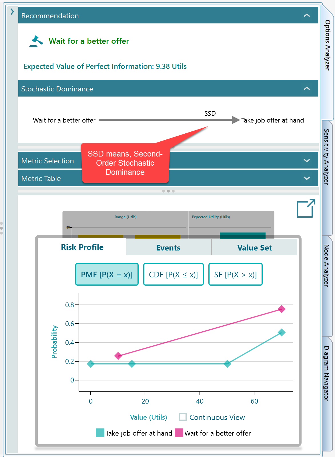
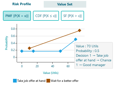
If you notice the Risk profile chart, you will understand how the chart portrays the Probability Distribution tables that we just discussed earlier.
The tooltip on the data points in the chart shows the detailed event name as shown below. For example, notice that the tooltip for the Action "Take job offer at hand" on the data point at X = 75 shows the event details.
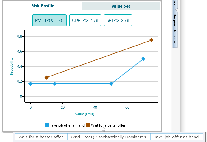
Stochastic Dominance
Stochastic Dominance is a form of stochastic ordering between random variables, as explained in detail on a separate page. Once the stochastic dominance is calculated, in addition to the stochastic dominance panel, the tooltip on the action name in the Risk profile chart displays the stochastic dominance information as well.
Cumulative Distribution Function chart
It is always useful to observe the Cumulative Distribution of two portfolios to compare state-by-state payoff/risks. In fact, such comparison is the basis of Stochastic Dominance which is discussed on a separate page. You can easily see the Cumulative Distribution for the Risk Profile by clicking the CDF button as shown here.
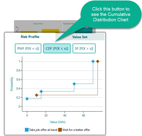
By looking at the above Cumulative Distribution chart, someone can tell that the act "Wait for a better offer" stochastically/probabilistically dominates the act "Take job offer at hand".
Survival Function Chart
The Survival Function is a function that can tell us the probability that something will survive beyond any given specified time. For example, if you want to know, what is the probability of a patient will survive AT LEAST for Some given Days, the Survival function is the function that shows that probability. It is related to Cumulative Distribution in a way that a Cumulative Distribution tells us what the probability that something will survive "AT MOST" X number of days is. Where the Survival Function can tell us the probability of "AT LEAST".
You can see the Survival Function chart from the same risk profile by clicking the SF button as shown below.
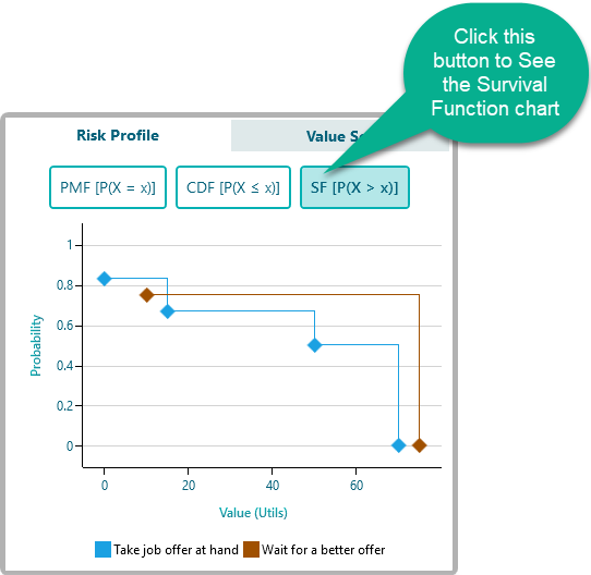
It is very very easy and intuitive to look at the Survival function to understand a Stochastic Dominance of 2 random variables. For example, if you look at the above chart, you can see that the "Probability that AT LEAST Utility value X will occur of Action 'Wait for a better offer'" is almost always higher than the "Probability that AT LEAST Utility value X will occur of Action "Take job offer at hand". So, we can easily infer that the act "Wait for a better offer" stochastically/probabilistically dominates the act "Take job offer at hand".
Showing shortlisted Alternatives
Although risk profiles can, in principle, be used to get a better insight into the risks/consequences, for complex decisions, it can be tedious to study many risk profiles. Thus it is better to look at the only first couple of risk profiles based on Expected Values. Therefore, when you have more than two actions, you will see a drop-down box showing up in the Risk Profile chart that says, "Show top X number of Options".
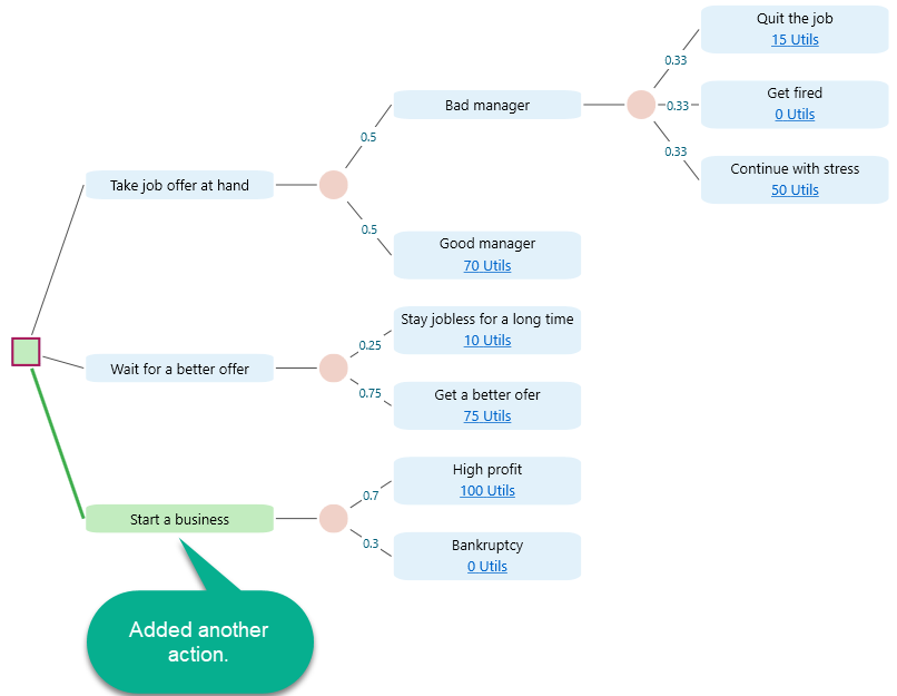
For example, say, you have added a 3rd action "Start a business" like this:
So, the Risk profile chart will show up like this:
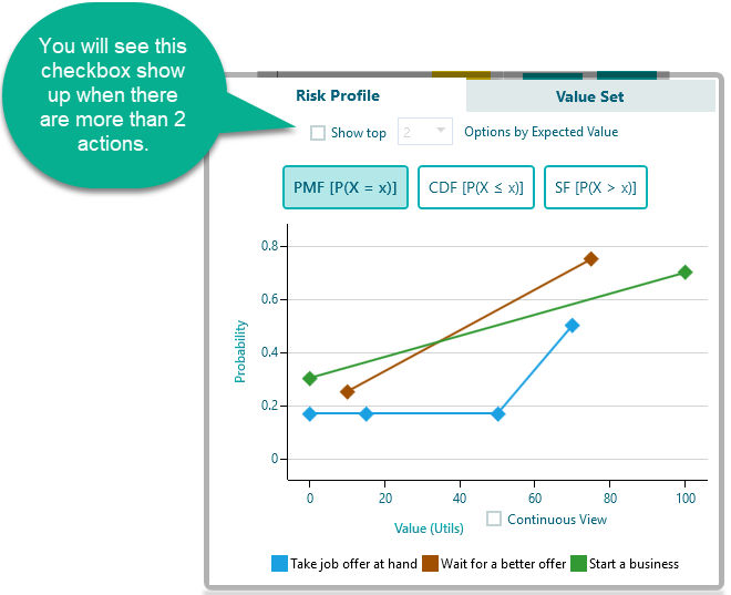
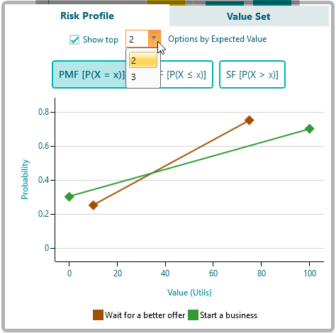
If you check that checkbox, you will be able to select the top X number of Actions based on Expected values.
Also, you can hide any action chart on the Risk profile by clicking on the Legend. For example, I have clicked the legend "Start a business" to hide its chart.
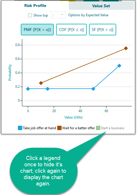
* Hiding legend works only when you are not already filtering the actions based on Expected value.
Showing all possible values (Another perspective of Risk Profile)
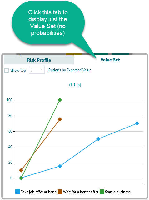
You can see the value set of all options which can give you another perspective. From the tab, select the "Value Set" as shown below.
Monte Carlo Simulation
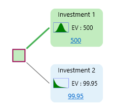
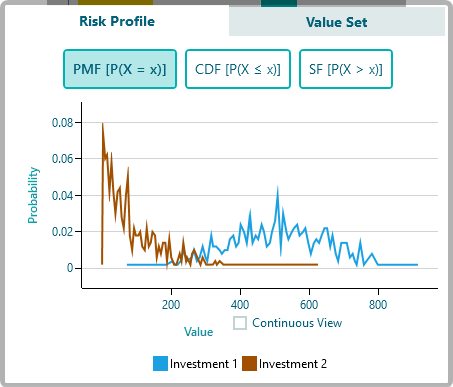
If you use any Probability distribution as a payoff for any node, then the Risk Profile chart is generated automatically using Monte Carlo Simulation. For example, say, you have a decision tree like this where the profit for Investment 1 follows a Normal Distribution and the profit for Investment 2 follows an exponential distribution.
You will see the Risk Profile chart as shown below (which is generated by Monte Carlo Simulation)
Node Analysis
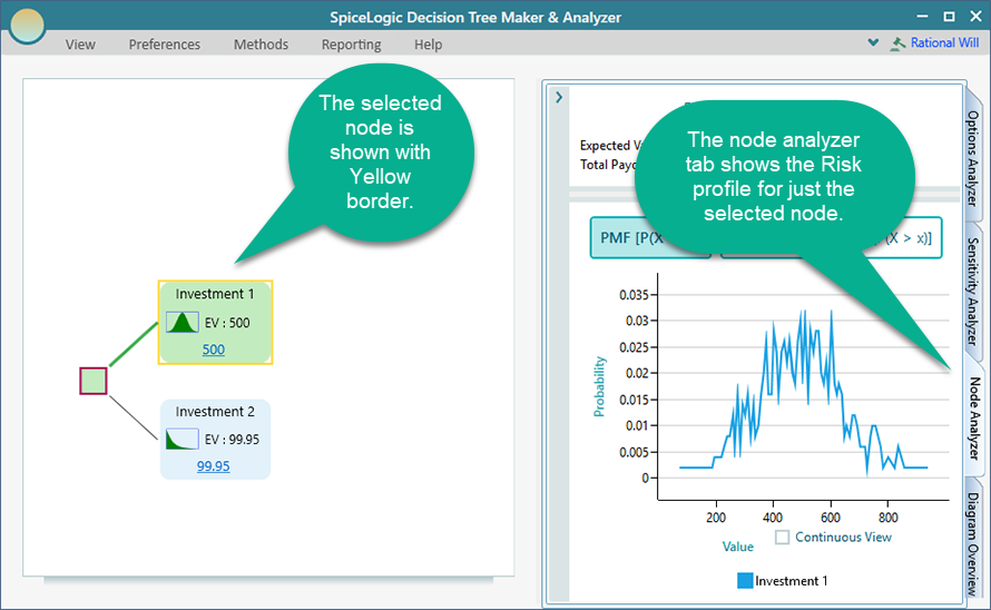
You can get a Node analysis for any Node in a tree you are interested in. For example, if you select a node and expand the "Node Analysis" tab, you will see the risk profile just for that selected node as shown below. Node analysis is explained in detail on another page.
