


Sensitivity Analysis
Sensitivity analysis is an important part of a good AHP decision. It helps you see which criteria or judgments have a real effect on the final recommendation, and which ones barely move the result.
In AHP Software, you can check sensitivity in three practical ways.
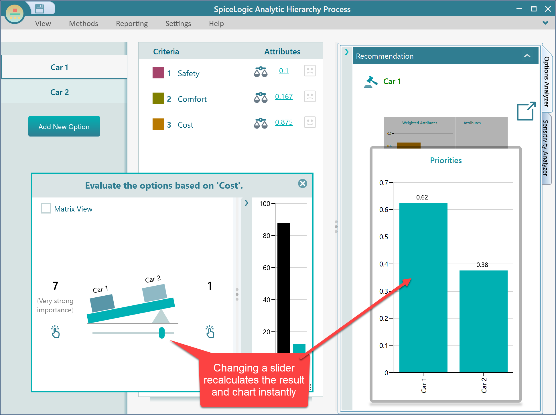
Observe the Result as a Slider Changes
SpiceLogic AHP Software recalculates the result instantly as you move a slider. When you change a pairwise comparison or another slider value, watch how the charts change. This gives you a quick feel for which variables influence the decision and in what direction.
Criteria Sensitivity Analysis
In the Options Analyzer panel, you will find a carousel of charts. Select the Weighted Attributes chart.
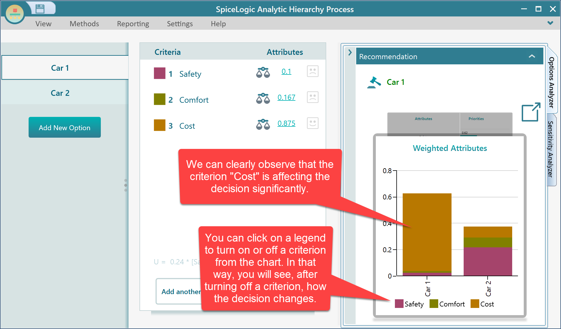
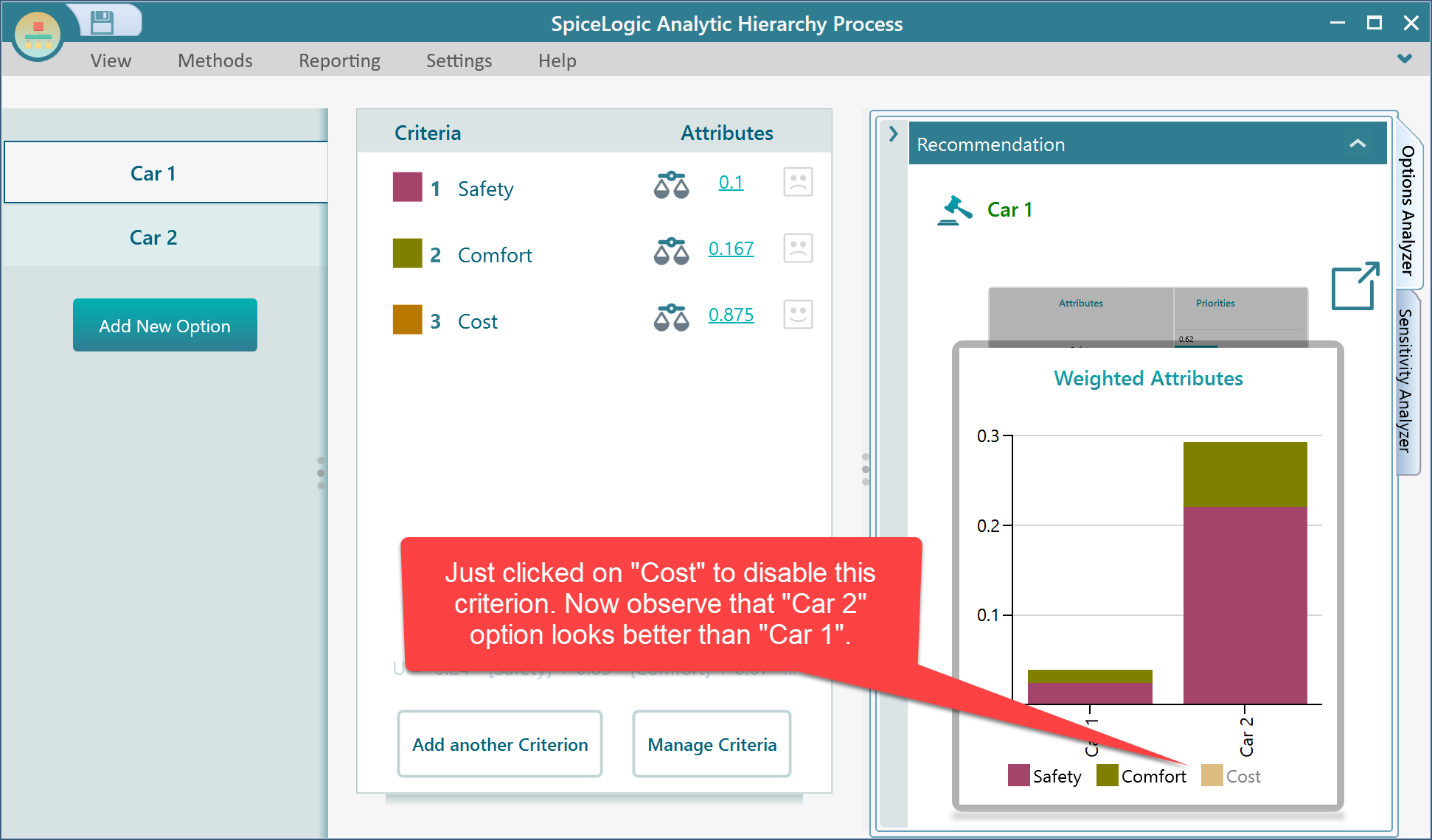
After you click the "Cost" legend in the chart, the Cost criterion is temporarily turned off. The updated chart shows that if cost is ignored, "Car 2" becomes the better option instead of "Car 1".
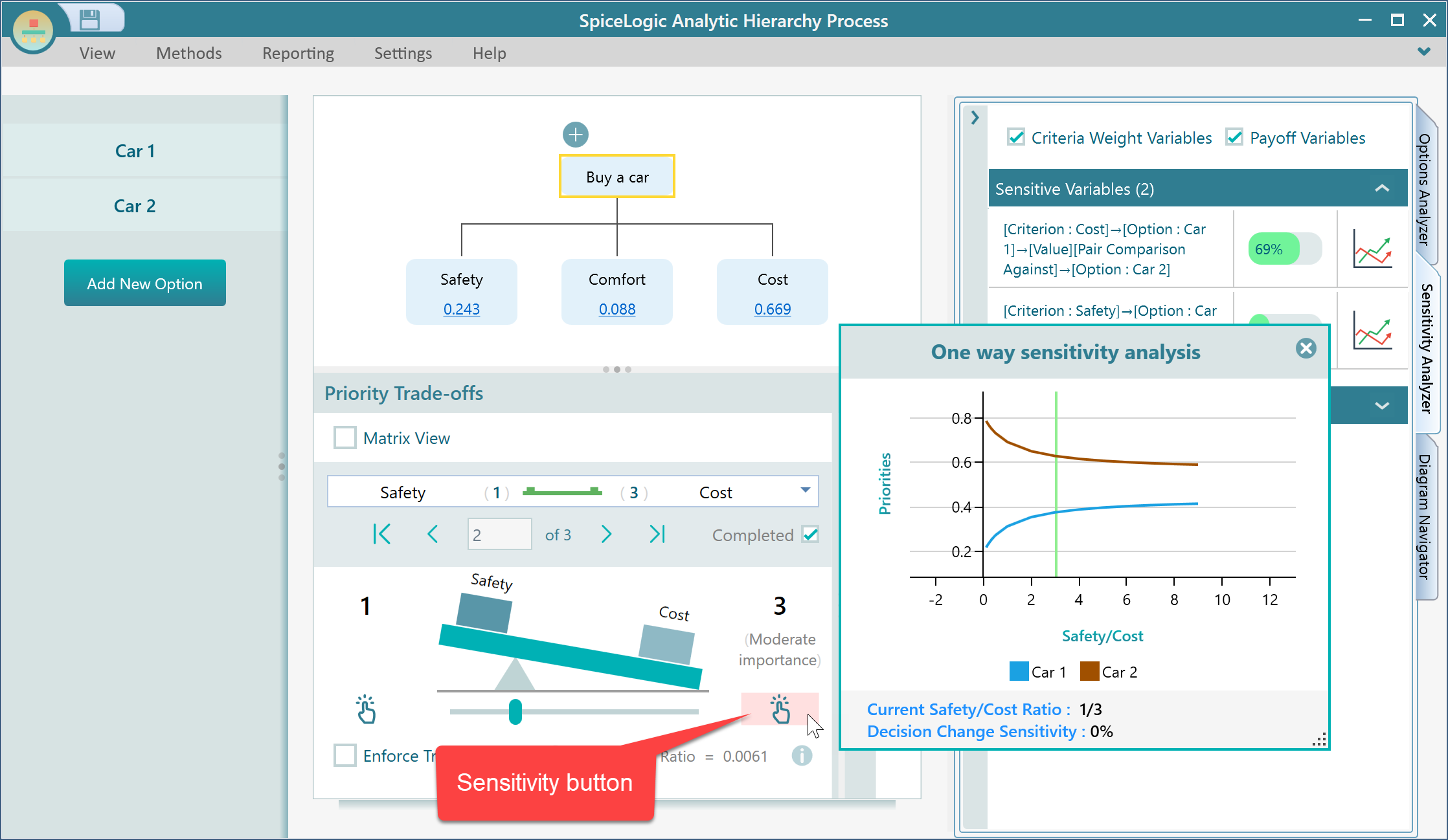
One-Way Sensitivity Analysis of a Variable
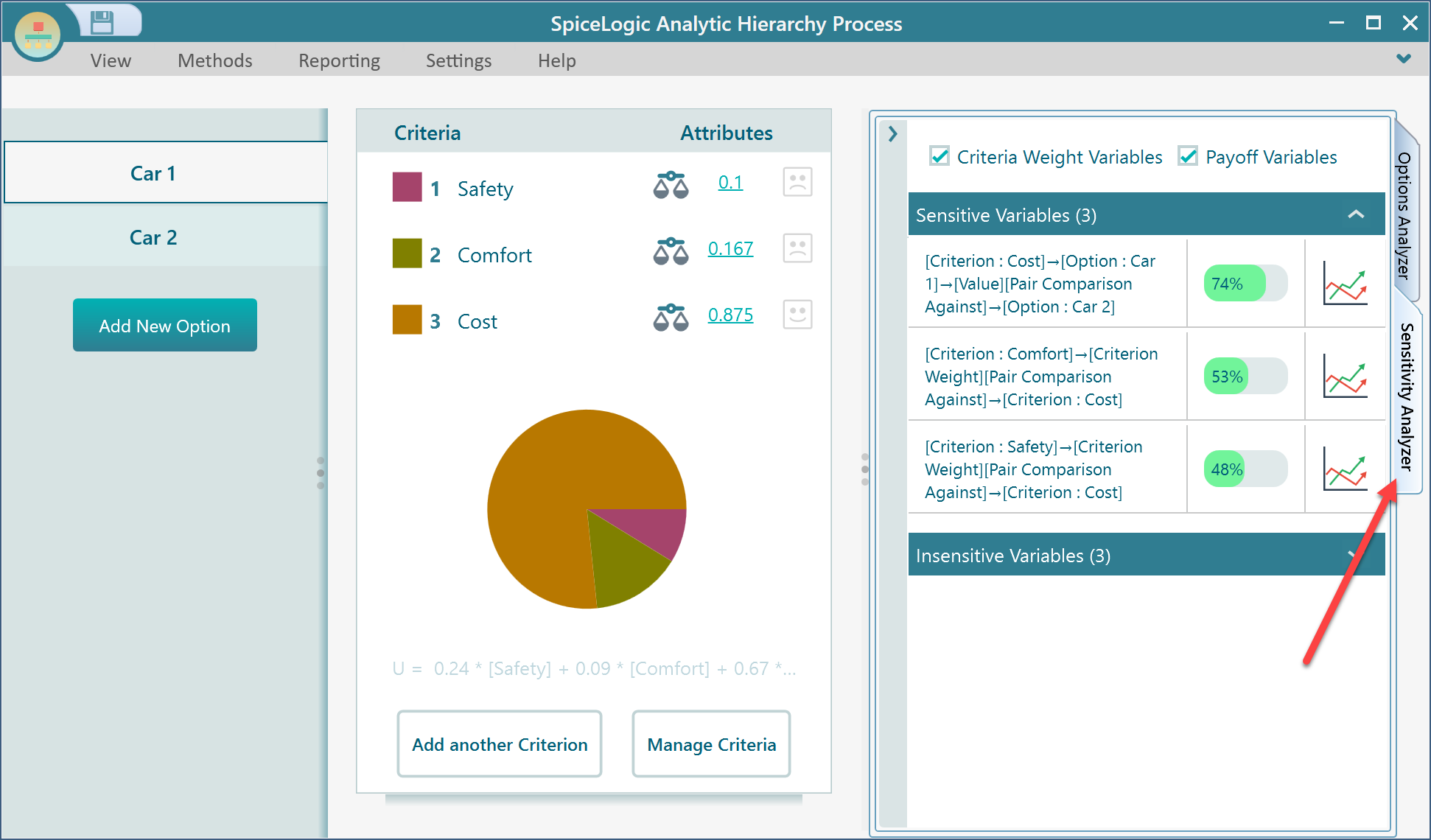
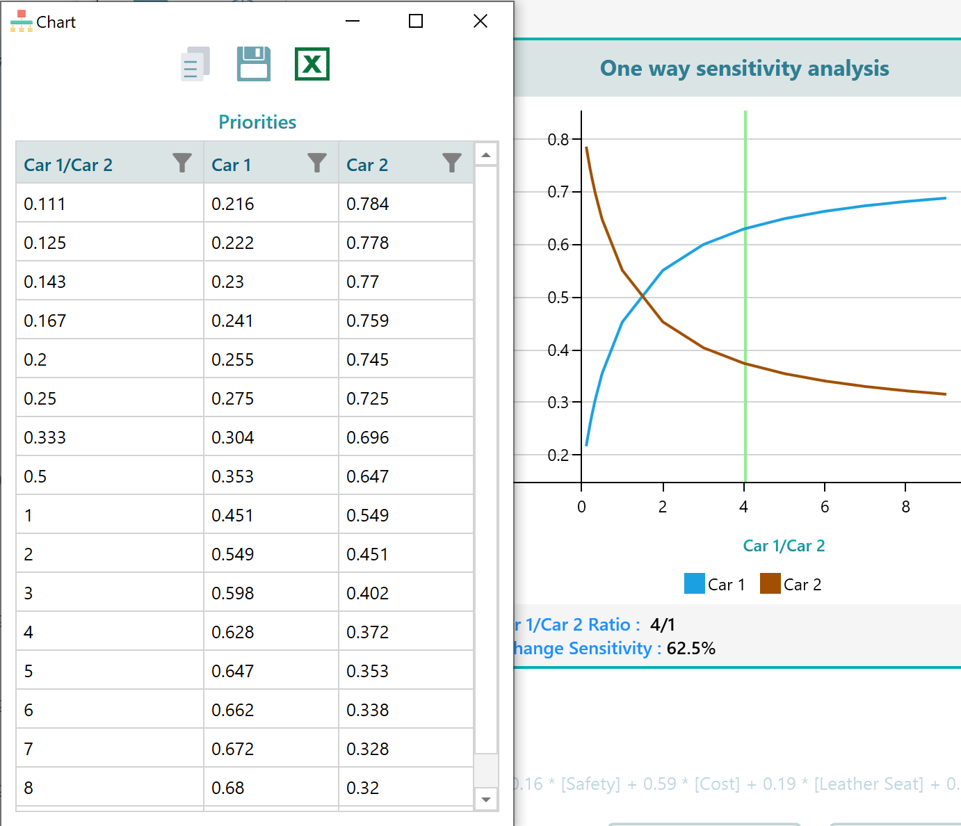
AHP Software can perform one-way sensitivity analysis and show how changing one variable affects the option values. Expand the "Sensitivity Analyzer" tab to see variables sorted by sensitivity rank.
The sensitivity rank is based on how much a variable must change before the final decision changes.
Sensitivity Rank = 100 - percentage of value change needed to alter the decision.
In the screenshot below, the most sensitive variable has a sensitivity rank of 74%. That means a 26% change within its possible value range can change the selected decision.
Click the chart icon beside a variable to open its sensitivity chart. For example, clicking the top variable opens the chart shown below.
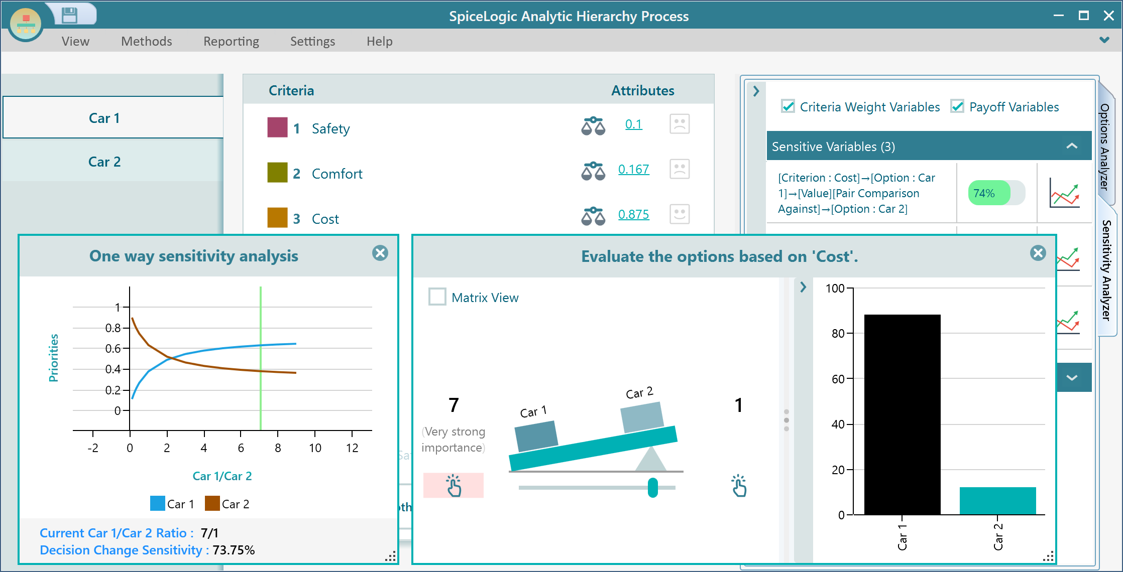
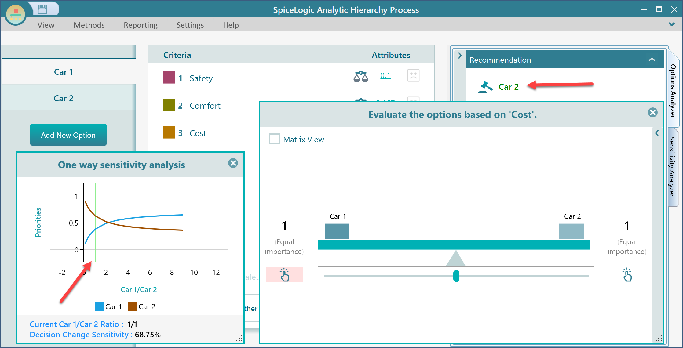
In this example, the most sensitive variable is the comparison between Car 1 and Car 2 for the Cost criterion. When you move the pairwise comparison slider, the green vertical line moves with the current value.
The chart shows that if the Car 1 to Car 2 value falls below 2, the winning option changes from "Car 1" to "Car 2". When the comparison changes from 7:1 to 1:1, the green line moves to 1 and the winner changes to "Car 2". The one-way sensitivity chart reflects that change immediately.
You can open the sensitivity chart for any variable by clicking the chart icon beside it.
View or Export the Data Table
Every chart in the application has a context menu with useful tools. Right-click the one-way sensitivity chart to export the image, copy the image to the clipboard, show the data table, copy the data table, or export the data table to Excel.
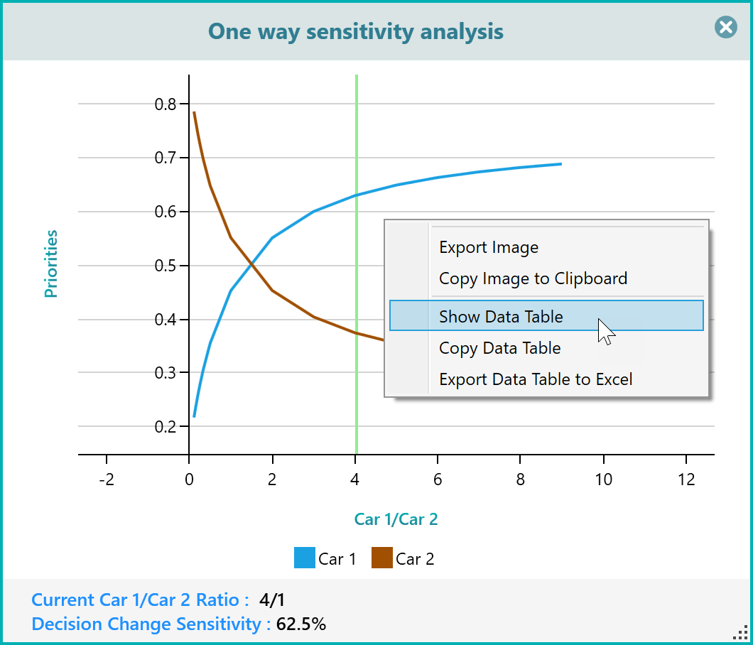
Click "Show Data Table" to view the chart data in a table.
You can export the data table to Excel from this panel as well.
Select Only the Series You Want to View
Like the other charts in AHP Software, the sensitivity chart lets you click a legend to show or hide a series. In the screenshot above, there are two legends: Car 1 and Car 2. Click the Car 1 legend to hide that series, and click it again to show it.
