


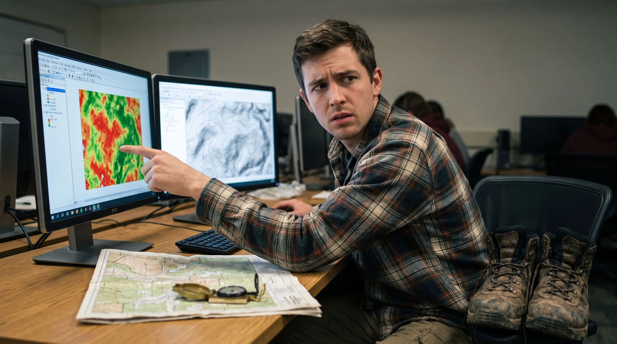
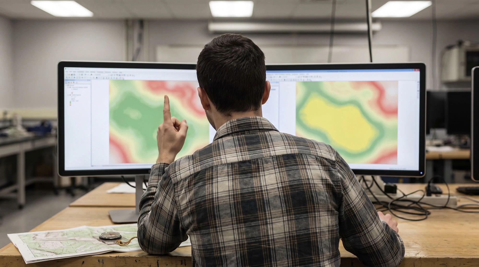
Tomas had the map printed at A3 and he was proud of it. Groundwater potential across his study area in five classes, deep green where the aquifer looked promising, red where it did not. Six months of work in one picture.
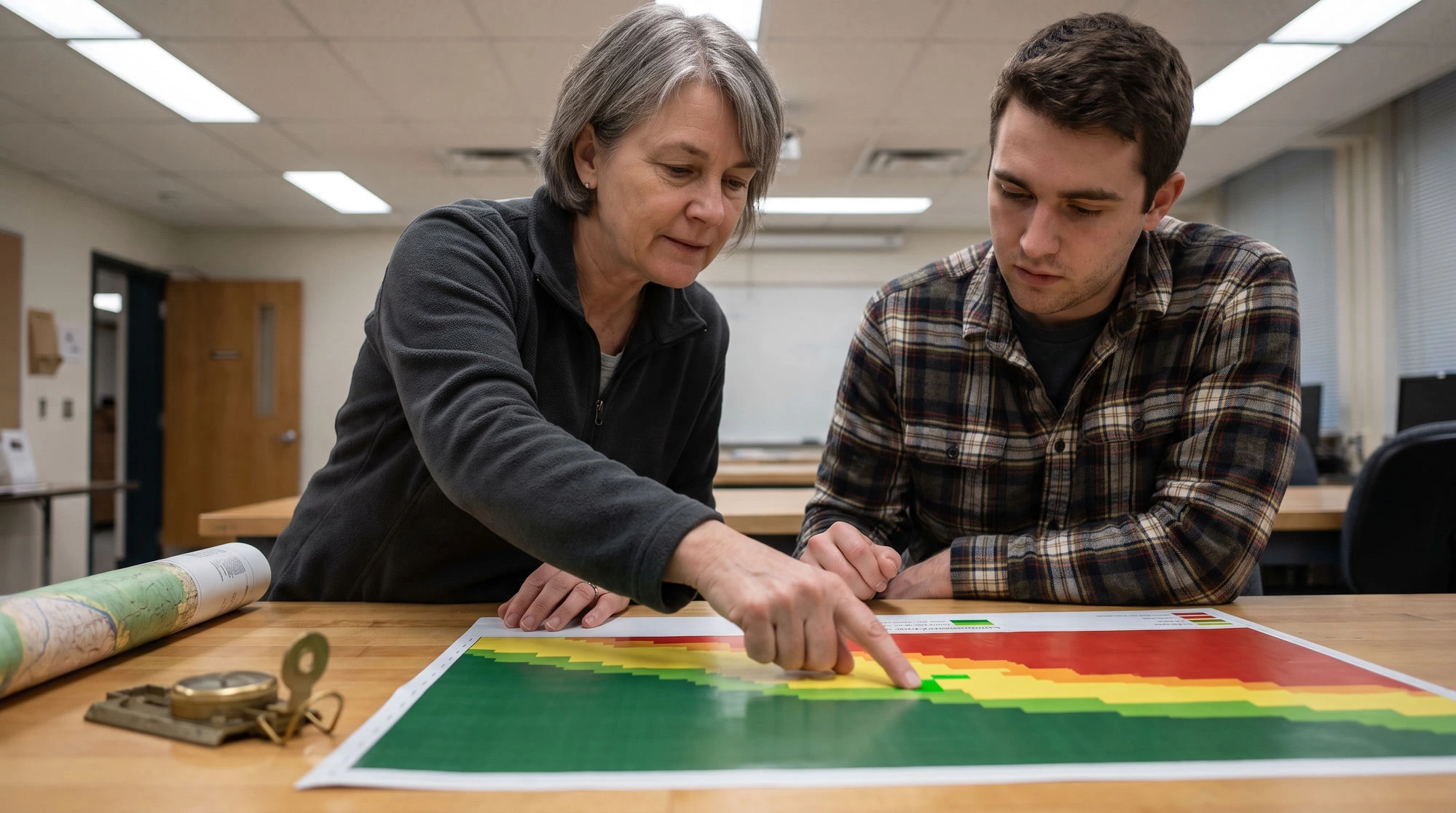
His supervisor looked at it for about four seconds, put a finger on one bright green cell in the northeast corner, and said: that is inside the national reserve.
Tomas knew it was. He had included the reserve boundary as a layer. What he had not understood until that exact moment was the difference between a factor and a constraint, and it is the single most common mistake in this whole family of theses: groundwater potential, landfill siting, solar farm placement, flood risk, land suitability, all of them. So let me start there, and then rebuild the map with him.
The lesson in three lines
A factor varies by degree, so gentler slope scores better than steeper. A constraint is absolute: you cannot drill inside a protected reserve at any weight.
Score a constraint low and the weighted overlay treats it as one vote among many, so strong scores elsewhere outvote it. That is how legally impossible ground comes out highly suitable.
Weight and combine the factors first, then multiply by a mask of 0 and 1 for the constraints, which forces excluded ground to zero whatever else is true there.
Why the reserve scored green
Tomas had reclassified the reserve layer so that pixels inside it scored 1 out of 9, the lowest suitability class, and fed it into the weighted overlay like every other layer. It felt like the right thing to do. It was punished, after all.
But a weighted overlay is a vote. The reserve pixel had excellent lithology, high lineament density and gentle slope, and those three strong scores simply outvoted one weak one. The result was a pixel that was legally impossible to drill and mathematically highly suitable. His examiner only needed to notice one such pixel.
Factors vary in degree. Slope is a factor: gentler is better, and there is a gradient of acceptability. Rainfall is a factor. Distance to a road is usually a factor. Constraints are absolute. You cannot drill inside a protected reserve, or within the legally mandated buffer of a river, at any weight. That is not a low score. It is a no.
Handle them separately. Factors get weights and are combined. Constraints become a boolean mask of 0 and 1 that multiplies the result at the very end, forcing excluded areas to zero no matter what else is true there. Tomas rebuilt his model on that basis, and the rest of this article is what he found along the way.
The two halves he had blurred together
The method has two halves that fail in different ways, and keeping them apart in your head is most of the battle.
AHP answers one question: relative to each other, how much does each factor matter? It produces a set of weights that sum to 1, plus a consistency ratio that tells you whether your judgments hold together. This half is expert judgment.
GIS answers a different question: at this particular pixel, how good is each factor? It produces a suitability surface. This half is spatial data.
They meet in one line of arithmetic, the weighted overlay. Almost every serious error is in the preparation on either side, not in that final step. Tomas's reserve problem was a GIS-side error. His next one was too.
Rebuilding, layer by layer
His raw layers were in incompatible units: slope in degrees, rainfall in millimetres, distance to drainage in metres, lithology as categories. You cannot multiply a weight by a millimetre and get anything meaningful. Every factor layer has to be reclassified to one common suitability scale first, commonly 1 to 5 or 1 to 9, where higher always means more suitable.
Going back through his reclassifications, Tomas found the second mistake. He had scored steep slopes high, because steep slopes have high slope values, and the number had led his hand. For groundwater recharge, gentle terrain is what you want, so gentle should score high. One layer reclassified in the wrong direction had been quietly pulling his map towards the hills. This is genuinely hard to spot after the fact, which is why you check the direction of every single layer before you overlay anything.
Two more things he tightened. Every class break needed a source. Why does 0 to 5 degrees earn the top class and not 0 to 3? He cited two regional studies and one hydrogeology standard, and that is what examiners ask about. And every layer had to share a coordinate reference system, cell size and extent before overlay. His rainfall layer was at 1 km resolution and his slope at 30 m. He resampled once, deliberately, wrote down what he did, and stopped getting the ragged edges he had assumed were a rendering glitch.

The weights, and a number he had tuned
Then the judgment half. Tomas had built a hierarchy with groundwater potential at the top and his seven factors beneath it, compared the factors pairwise, and got a consistency ratio of 0.14. Saaty's guideline is 0.1 or below. He had nudged two numbers until it read 0.09 and moved on.
His supervisor asked to see the comparison matrix. That is the thing about a tuned ratio: it looks acceptable on the summary page and it leaves fingerprints in the matrix. Together they found that two of Tomas's judgments genuinely contradicted each other, one about lineament density versus drainage density and one about lithology versus slope. He re-thought both, honestly, and the ratio came out at 0.07 without anyone adjusting anything to make it. He reported the original value, the revision, and why.
If your weights come from a panel rather than from you, you also have to say how you combined them. Aggregating individual judgments merges the pairwise matrices with a geometric mean and derives one set of weights; aggregating individual priorities calculates each expert's weights and pools them. One sentence, which and why.
The full comparison matrix, the resulting weights and the consistency ratio all went into the appendix. That is the reproducible core of the method and the part a reviewer can actually check.

The overlay, done properly
A weighted overlay is a vote.
With reclassified factor layers and AHP weights, the suitability index at every pixel is the weighted sum:
S = Σi ( wi × xi )
where w is the AHP weight for factor i and x is that pixel's reclassified score. In QGIS or ArcGIS this is a raster calculator expression or a weighted overlay tool. Because the weights sum to 1 and the scores share a scale, the output lands on that same scale and stays interpretable.
Then, and only then, the constraints:
Sfinal = S × C1 × C2 × ...
where each C is a layer of 0 and 1. The reserve went to zero. The river buffers went to zero. Nothing about lithology or lineaments could argue them back.
Tomas classified the final surface into five classes for the map and, because he had learned the lesson by now, wrote down that he used natural breaks and why. Natural breaks, equal interval and quantile each give a different-looking map from identical data, which is exactly why the choice needs a sentence.
Forty-one boreholes
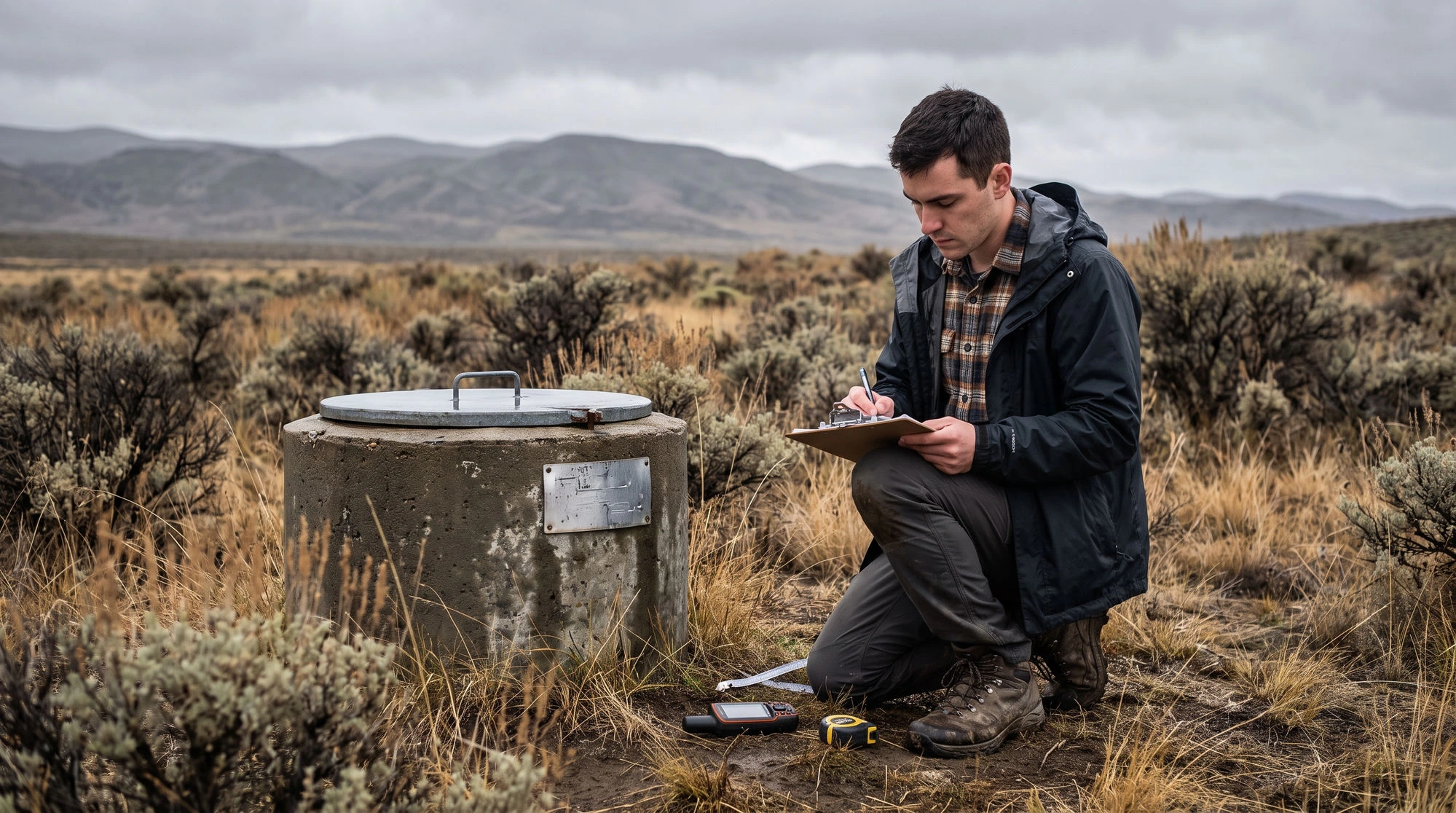
An unvalidated suitability map is a hypothesis presented as a result. Tomas had a dataset of 41 existing boreholes with recorded yields, and he had not used it, because the map had looked right.
He overlaid them. High-yield boreholes fell overwhelmingly in his high and very high classes, low-yield ones in the low classes, and an ROC curve gave an area under it of 0.78. That single number turned a picture into a finding.
How you validate depends on your topic. Groundwater studies check against borehole yields. Landfill studies check whether existing permitted sites land in suitable zones. Solar studies check against operating installations. Where you have enough known points, ROC and the area under it give you a defensible figure. Where you do not, even a documented field visit to a sample of predicted high and low zones beats nothing. If validation is genuinely impossible for your case, say so explicitly and say why. Stating the limitation is normal. Omitting it is what gets challenged.
The factor that redrew a third of the map
The obvious defence question is what happens if the weights were somewhat different, so Tomas prepared for it before the map was final rather than after.
The straightforward version is to remove one factor, recompute, and report how much of the map changes class. Dropping rainfall moved about 4 percent of pixels. Dropping lineament density moved 31 percent. That told him lineament density was doing a lot of the work, and it earned a full paragraph justifying its weight, which he would not otherwise have written.
Our AHP Software ranks each variable by how far it would have to change before the outcome changes, which points you at the fragile assumptions before you spend a day reprocessing rasters. Tomas did his sensitivity on the AHP side first and only then committed to the GIS run.
It also surfaced a subtler problem. Drainage density and lineament density were strongly correlated across his terrain, which meant he had effectively counted one property of the landscape twice and given it hidden weight. He ran a correlation check on his factor layers, reported it, and kept both with a justification. Checking is what mattered; the examiner asked about exactly that.
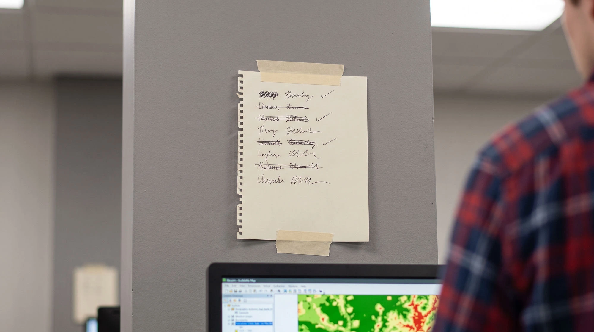
The list Tomas keeps taped above his monitor
- Constraints treated as low-scoring factors, so forbidden areas can still score well.
- One layer reclassified in the wrong direction.
- Layers combined at mismatched resolution or projection.
- Class breaks with no cited justification.
- A consistency ratio adjusted until it passed rather than resolved.
- Weights reported without the comparison matrix behind them.
- No validation and no acknowledgement that there is none.
- Highly correlated factors both included without checking.
He hit five of the eight. His defence went well because he found them before his examiners did.
Where the software fits
Your GIS package does the spatial half. For the judgment half you need pairwise comparisons, a consistency ratio you can trust, expert aggregation if you have a panel, sensitivity analysis, and output you can paste into an appendix.
Our AHP Software handles that side, including questionnaire export and import when your weights come from a panel rather than from you, and printable reports for the write-up. If you only need weights for a handful of factors and want to check the mechanics first, the free online AHP calculator gives you the weights and consistency ratio in the browser, and you can take those numbers straight into your raster calculator.